Anushree Reddy Flagship Store
Design Firm: Sona Reddy Studio
Principal Architect: Sona Reddy
Location: Hyderabad, India
Project Typology: Retail
Photographer: Pankaj Anand
Sona Reddy Studio conjures to life a whimsical and rooted design narrative within the premises of the Anushree Reddy Flagship Store in Banjara Hills — garbed in timeless sensibilities which fraternize seamlessly with modern nuances and nature with elan.
Secluded amidst a lush landscape in the beating urban heart of Banjara Hills – Hyderabad, the Anushree Reddy Flagship Store crafted to life by Sona Reddy Studio is the epitome of grace and rooted design sensibilities amalgamated in absolute unison. With multiple stores created for the coveted eponymous couture label over the years under a similar collaboration, the fashion designer approached the Architecture Studio intending to create a flagship venue that embodies the brand’s intrinsic values and identity at its core.
Timelessness, elegance, and a quiet romance overrule the garments of the designer’s à la mode collections, defining the aesthetic her brand dons unabashedly. With over seven years in the industry, the store needed to be the honest flagbearer of the neoteric design identity the label upholds, while remaining tethered to traditional influences that anchors their creative impetus.
The three-levelled store is burrowed in the plush neighbourhood, creating a whimsical escape into the world of Indian couture within the nucleus of the city. “Anushree’s brief pivoted around the creation of a space that brought forth the brand’s persona and expressed it via spatial experiences that were interlaced with equal doses of subtlety and surprising vignettes,” shares the Architect.
Monotone employment of colour reigns exteriors and interior spaces, wherein hues and textures often make a debut through earthy Indian materiality, expressed via locally sourced stones, oxide finishes, cane, stained natural wood, and a peppering of antiques conceptualized as artisanal installations and furniture in various nooks.
“The design process focuses on making simplicity and untainted spatial expression its primary arsenal. A sense of continuity presides over the various segments of the layout, attributed to a binding thread of homogenous design. The existing commercial structural shell at hand posed numerous challenges; the same were navigated while creating engaging interior volumes that were also compelling to the passer-by from the storefront’s design perspective — creating stimulating experiences indoors and outdoors,” adds Sona. The services were integrated into the design scheme inconspicuously, allowing only the merchandise to assume the spotlight in the envisioned atelier.
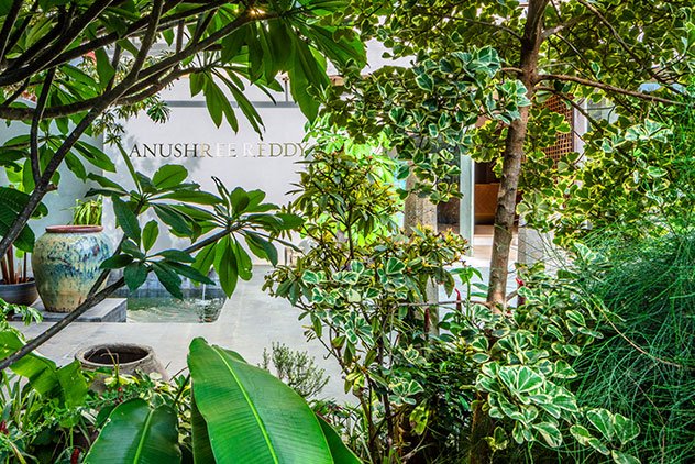
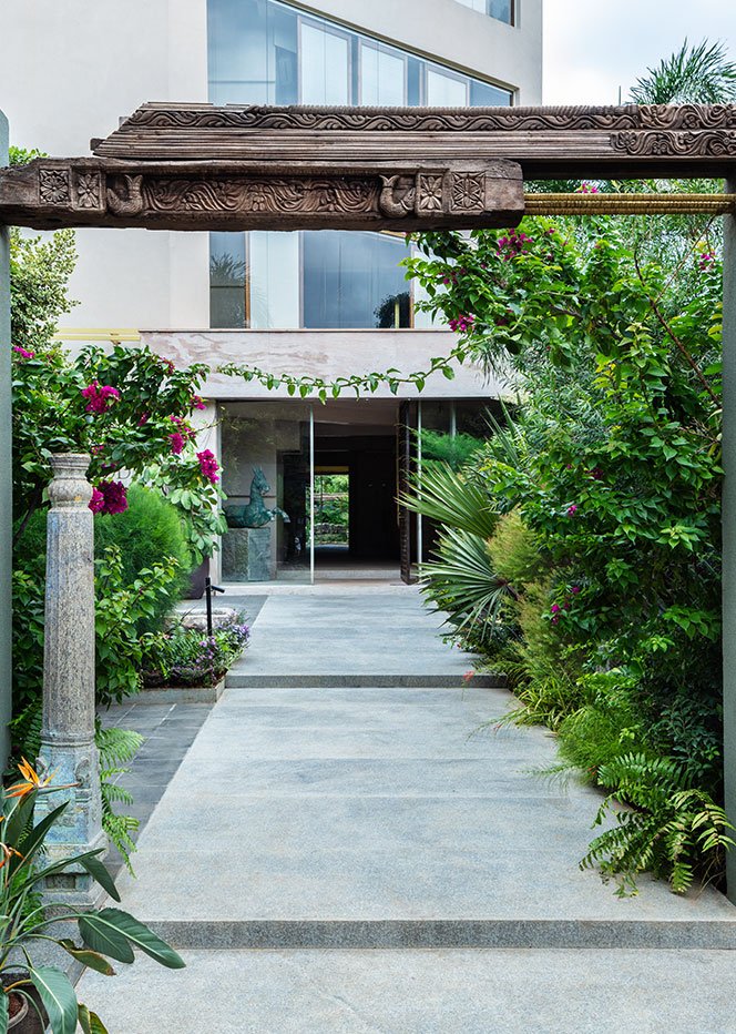
The unassuming entrance to the store lies beyond an olive granular-textured focal wall that bears the label’s name in brazen letters. Its pared-down demeanour beckons one inside, urging them to explore the exterior landscape and all the foliage that seems to devour the built structure it cradles within. An antique intricately carved beam graces the entrance into the premises like a Torana; the vintage beam is meshed in with modern brass wire-clad rebars, symbolising the harmonious union of the old and new that one is about to witness.
Basalt and granite pathways harbour a tactile feel, allowing one to feel connected to the innate grounded sentiment of the space. Antique ruins, pillars, sculptures, and patina-laden planters dot the scenery, hinting at the continuous flux amidst the past and the present. A custom mammoth stone bench perches boldly by the entrance, levitating atop a ten-foot-long stone base, allowing one a moment to dwell in the midst of the verdure, to soak in how nature engulfs the premises in its entirety. A Koi Pond embraces the perimeter of the façade, engaging yet another element of nature into the narrative.
The building is swathed in a beige granular texture, allowing it to meld humbly into its context which is echoed as an immersive and theatrical milieu indoors. The horizontal brass members extend across the expanse of the elevation, making a modish statement while complementing the gilded label signage. The vertical fins along the perimeter of the storefront make for a deliberate architectural feature, contributing to the stark geometricity of the structure.
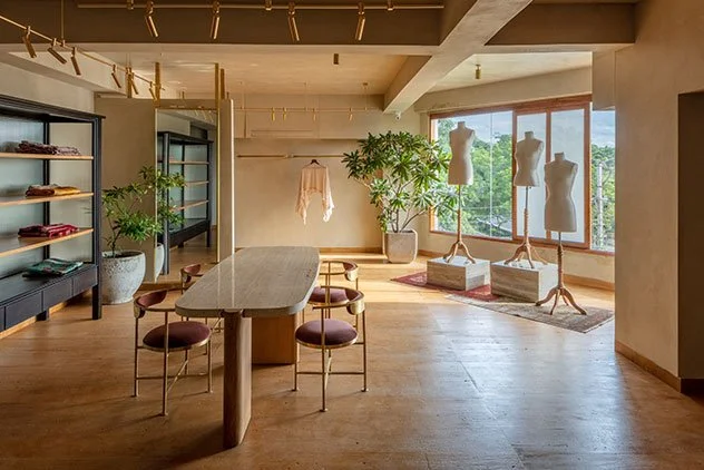
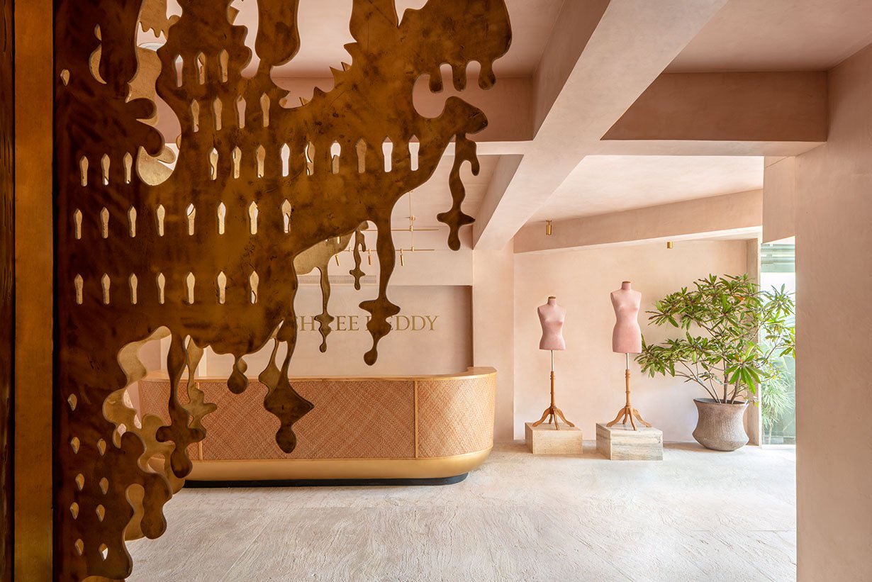
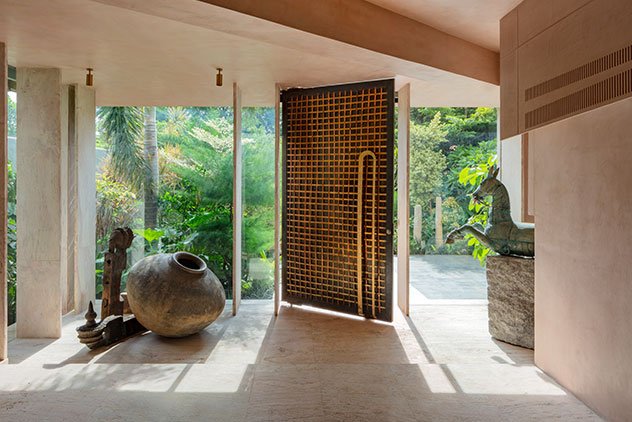
A bespoke brass and copper metal weave door reveals an open-plan store floor on the ground level. The main door is flanked by a horse-bust relic mounted on a stone cube on one end and a weathered beam and pot installation on the other. Pink sandstone and blush oxide-finished walls bathe the spatial shell, making the hue a leitmotif in the space. Mannequins don an artistic presence as they have been imagined as objets d’art in the space, hoisted upon stone cubes for scale and presence alongside sculptural indoor plants with robust silhouettes.
The billing counter had been created with an arched profile consisting of wood and a cane-wrapped exoskeleton. The waiting lounge houses the pièce de résistance of the studio — a glorious brass chandelier that takes two-dimensional beaten brass sheets and pieces them together to create a colossal fixture that has been modelled off the traditional profiles of the chandeliers that embellish the Chowmahalla Palace in the city dating back to the era of Nizams. The monolithic stone bench and table in the lounge add coarse and natural finesse to the space while hosting myriad antique curios like the angelic sculpture that peers down on the nook. Towards the rear end of the floor, the collage of inverted arched hanger rods poses as an installation, allowing the garments to become the true protagonists.
The staircase presents itself as a vital design element while establishing a connective flow between floors — it becomes the threshold that witnesses a change of materiality and hue across floors, creating morphing visuals as one navigates the vertical volume of the structure. An array of brass ellipses creates the balustrade, and a wooden handrail composes the staircase, reiterating the coexistence of modern and traditional materials.
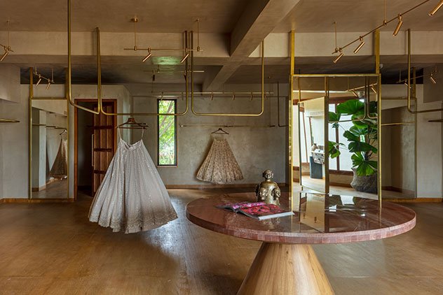
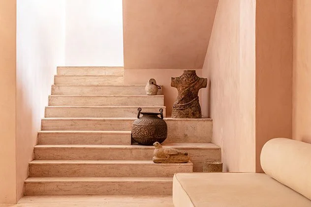
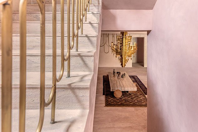
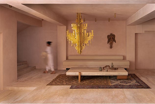
On the first level, yellow sandstone takes over the flooring while beige oxide adorns the walls to create a warm interior space. Inverted brass hanger rods cascade from the ceilings, creating display sections for the garments. The brass-profile mirrors act as spatial demarcations across the blueprint, amplifying the apparent volume of the space with the reflections and added sense of light indoors.
A discussion zone occupies the central portion of the floor, wherein a sizeable circular marble and wood table defines the zone. The trial rooms located towards the rear of the layout have cane and wood doors with sleek brass hardware. Stretched fabric and wood adjustable window panels line the western façade, instilling a play of light and shadows as the sun travels across the sky.
Similar to the first level, the combination of yellow sandstone floors and beige oxide walls make their way to the second level. Brass hanger rods protrude from the walls displaying the merchandise and the brass-framed mirrors too punctuate the space. An organic-form marble and wood composite table frame the custom saree display unit, creating a space for patrons to be seated while perusing collections. Stone cube bases are paired with mannequins to create artistic statements across this floor much like the ground level. A stone bench sits medially between trial rooms on the floor, creating a snug spot by the rectilinear picture window. The fabric and wood window panels are continued on this floor along the western elevation.
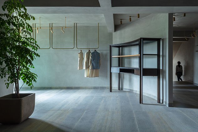
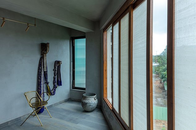
The third level housing the designer’s workspace and select display spaces observes a shift in the colour story as an austere grey shade douses the volume of the space with grey sandstone floors and soft grey oxide-finished walls. A curvilinear partition wall bifurcates the floor space adeptly. A custom curved wood and metal display unit sits fittingly against the sinuous wall; brass hanger rods and mirrors also feature in the display space, tying in with the other floors. Anushree’s workspace is replete with curated antique wooden installation pieces draped by a treasured heirloom Banarasi saree belonging to the designer’s collection, and a stone desk crafted to perfection.
At the Anushree Reddy Flagship Store, newfound light is shed upon the richness of Indian traditionality and its perennial place in the universe of both space and fashion design. “The atelier needed us to make a statement with our design expression and we strived to do just that! Shedding the preconceived notions around the design of most boutique venues, the Anushree Reddy Store relies on its acute penchant for detail, heritage, and modern undertones to piece together the quintessential space for the designer’s vision and creations — a saga in colour, texture, and sensorial design,” concludes the Principal Architect.
This piece was curated for the design studio’s portfolio on their website.
