Le Marche
Design Firm: groupDCA
Principal Architect: Rahul Bansal
Location: Gurgaon, India
Project Typology: Retail
Photographer: Suryan and Dang
Le Marche (translates to ‘The Market’ in French) is a one-stop-shop venue with branches across Gurugram and Delhi, which brings gourmet retail services to its patrons. With large floor plate retail destinations gaining momentum in India, groupDCA was brought on board by the company to align the brand’s identity and the spatial design scheme of their newest branch. The impetus stemmed from the need to recalibrate the retailer’s vision through design interventions while ensuring an immersive curated retail experience.
The storefront is composed of classic, black-bodied wainscoting panelling that extends as sectioned glazing, offering expansive views of the store’s interiors. The vermillion logo signage assumes centerstage, complementing the eminently witnessed monochrome color palette. The entrance is flanked on either side by focal LED Screens, utilised as dynamic surfaces for the store to display their products and offers effectively.
The anterior section of the store has been designed taking cues from the organic and lively layout of the bustling bazaars and communal marketplaces common in towns and cities. This zone has deliberately been kept void of towering storage racks to institute an engaging and fluidic sense of circulation.
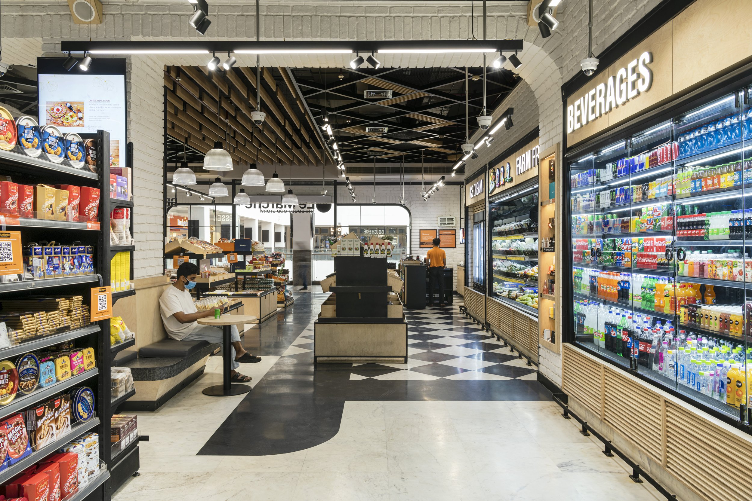
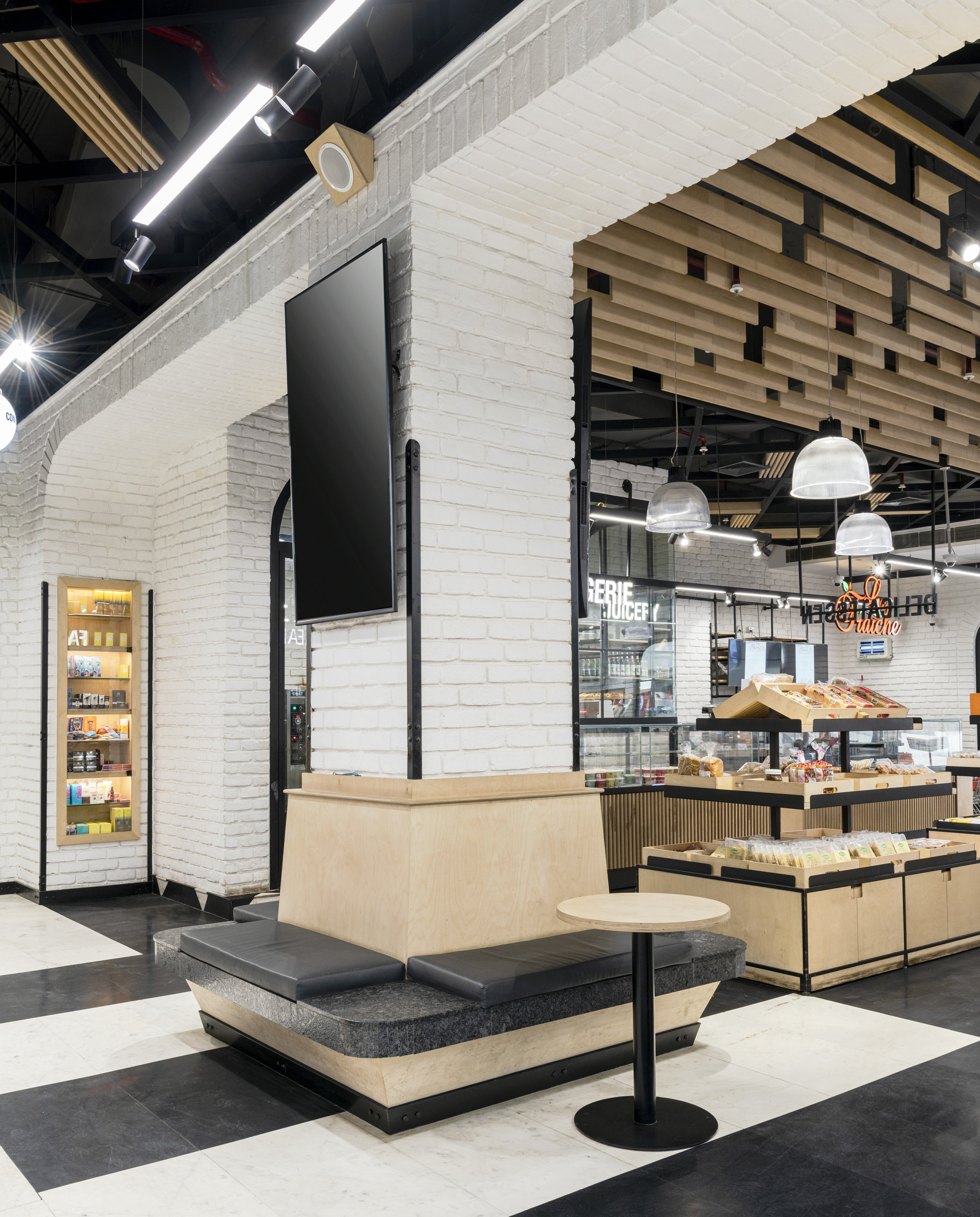
The left-hand side hosts the cash desk lined with small items the patrons can impulsively pick up while checking out. The right side is earmarked by a salad bar, cheese variety display, and an open-oven pizzeria for the customers to indulge in with compact seating spots peppered across the store. The central zone consists of gondolas that house the latest product inventory and fresh produce.


As one navigates further into the layout, the core organised retail section assumes the spotlight. Keeping the end-user’s comfort in mind, the number of aisles and the distance between them were optimized to allow the retailer to showcase a wide spectrum of inventory and ensure a hassle-free shopping experience. Ergonomically driven details like that of rack spacings, heights, and positions were considered to further elevate the efficiency of these zones.
The rear portion of the Le Marche store anchors a dedicated cold cuts section and a wine and beverages boutique. This offers the customers independent enclosed areas to shop for these products in the form of separate rooms integrated into the layout while keeping the schematic services intact; imagined as shopping for select items under the roof of one larger centralized store.
As a venue that offers an extensive range of world foods, household items, and other staples, navigation within the store needed to be prioritised. The monochrome colour scheme becomes the leitmotif at Le Marche, building on the brand recall sentiment via the materials and finishes.
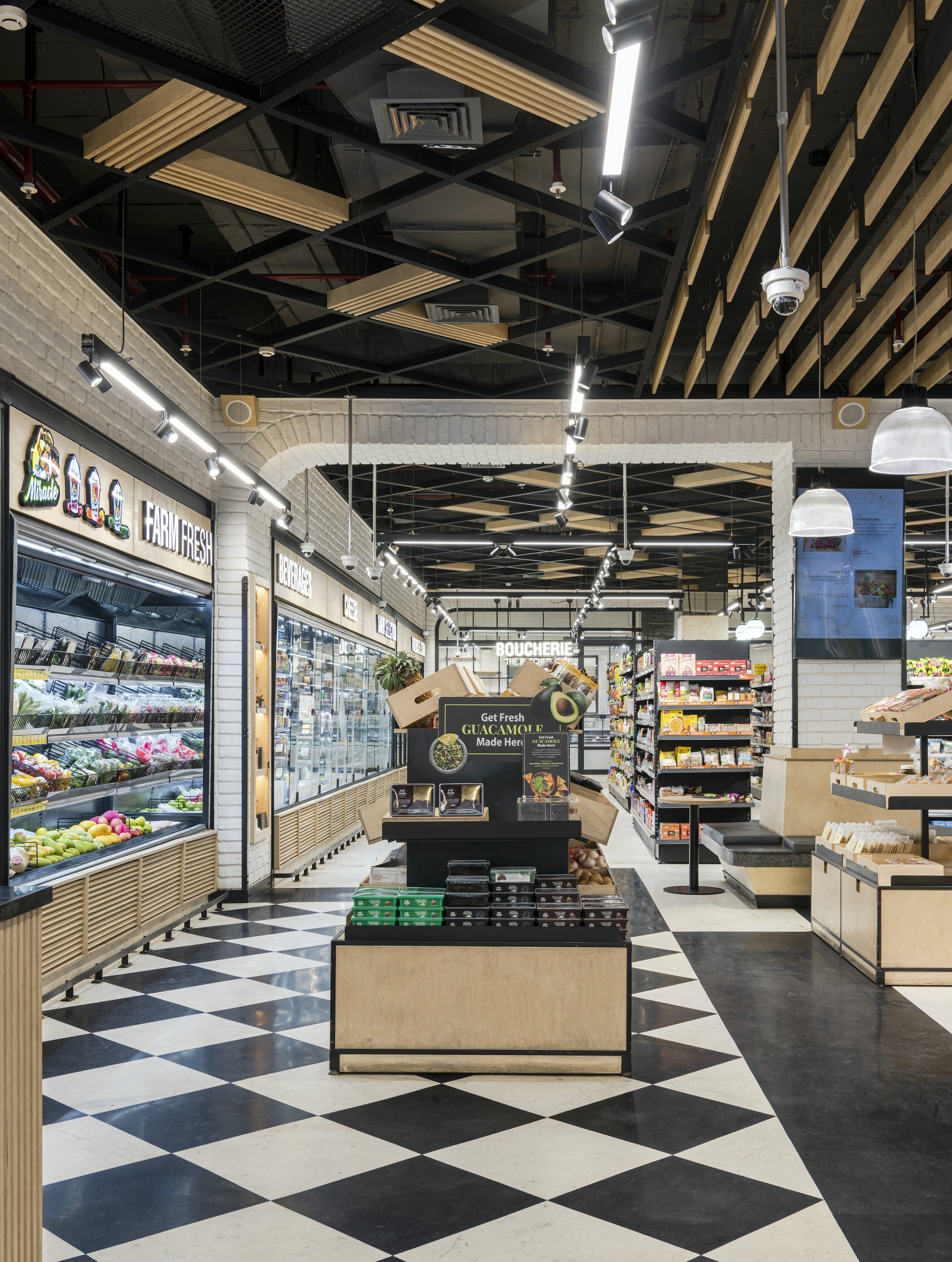
The broadly black and white interiors are timeless in nature, and they also create a distinctive visual identity. The harlequin checkered floors, the stretches of monochrome tiles, the sleek metal partition systems, and the light wood tones punctuate the blueprint as binding threads of design. The myriad hues that adorn the products housed within the store act as embellishments of colour against the neutral canvas of Le Marche.


Lighting plays a crucial role in the conceptualization of retail environments. This design element influences customer behaviour as the overarching ambience of a space is impacted instantly by the tailored lighting scheme employed therein. Steering clear of generic ambient lighting, all the lighting fixtures at Le Marche are customised task lights that enable the vast range of products to become the purposeful visual focus within the space.
The spotlights mounted upon the track systems illuminate the area they come in contact with in a diffused light that makes for an aesthetic and pragmatic intervention. These lights also divert the visual focus away from the utilitarian exposed ceiling which is a composite of wooden louvred and metal grid members. These lights also pose as subconscious visual guides that aid customer circulation across the layout. Brightly illuminated signage boards dot the layout, enabling customers to easily traverse the store.
At Le Marche, groupDCA has helmed the endeavour of reimagining and planning the primary retail design of the brand while curating a premium shopping experience. The pivotal creative penchant has been to transform the chore of visiting a departmental store into a sumptuous and appealing retail visit that strikes a chord with the end-user through evocative design.
This piece was published on Retail Design Blog (November 2021).


