North A11
Design Firm: Verdant Atelier
Principal Architect: Kavisha Patel
Location: Ahmedabad, India
Project Typology: Residential
Photographer: Nayan Soni
Project Stylist: Saniya Tadha
Project Cinematography: Ravi Mistry
This Japandi-style dwelling celebrates the oneness of minimalism and modernity, posing as an idyllic home for the Architect and her family, bestowed with copious daylight, texture-play, and neutral tones.
Roosted in western Ahmedabad’s coveted residential stretch, North A11 comes alive as a minimalist haven for the Principal Architect and her family. Idyllically designed for the young nuclear family, the residence embodies the maxim of ‘less is more’, drawing restraint-laced design to the forefront.
“Donning the cape of the Principal Architect of our home has been an experience layered with excitement, joy, and gratitude! In some ways, this residence is a love letter to everything my husband, Kalp, and I love! We are both architects by vocation; while I actively practise, Kalp has forayed into real estate. We love to travel and soak in art, culture, and architecture the world over. The genesis of this home is inspired by an unforgettable holiday in Norway where we got to experience Scandinavian design as its epitome,” recollects Kavisha.
The couple’s shared inspiration laid a sound foundation for them to embrace the blank slate and make it their own. With many hours at the drawing board immersed in detailed conversations, Kavisha and Kalp envisioned the Japandi style fitting for their dwelling, marrying the facets of Japanese and Scandinavian design.

Leitmotifs of abundant natural light, sweeping volumes, muted hues, and textured wood tones appear homogeneously across the apartment, celebrating the best of both design disciplines.
“Japanese design is famed for its use of nature-inspired materials, simplicity, and a sense of mindful living. Echoing a similar intent, Scandinavian design represents comfort, minimalism, and functionality. By adopting the path of Japandi design, we’ve been able to inhabit a space that channels all these aspects that struck a chord with us,” highlights Patel.
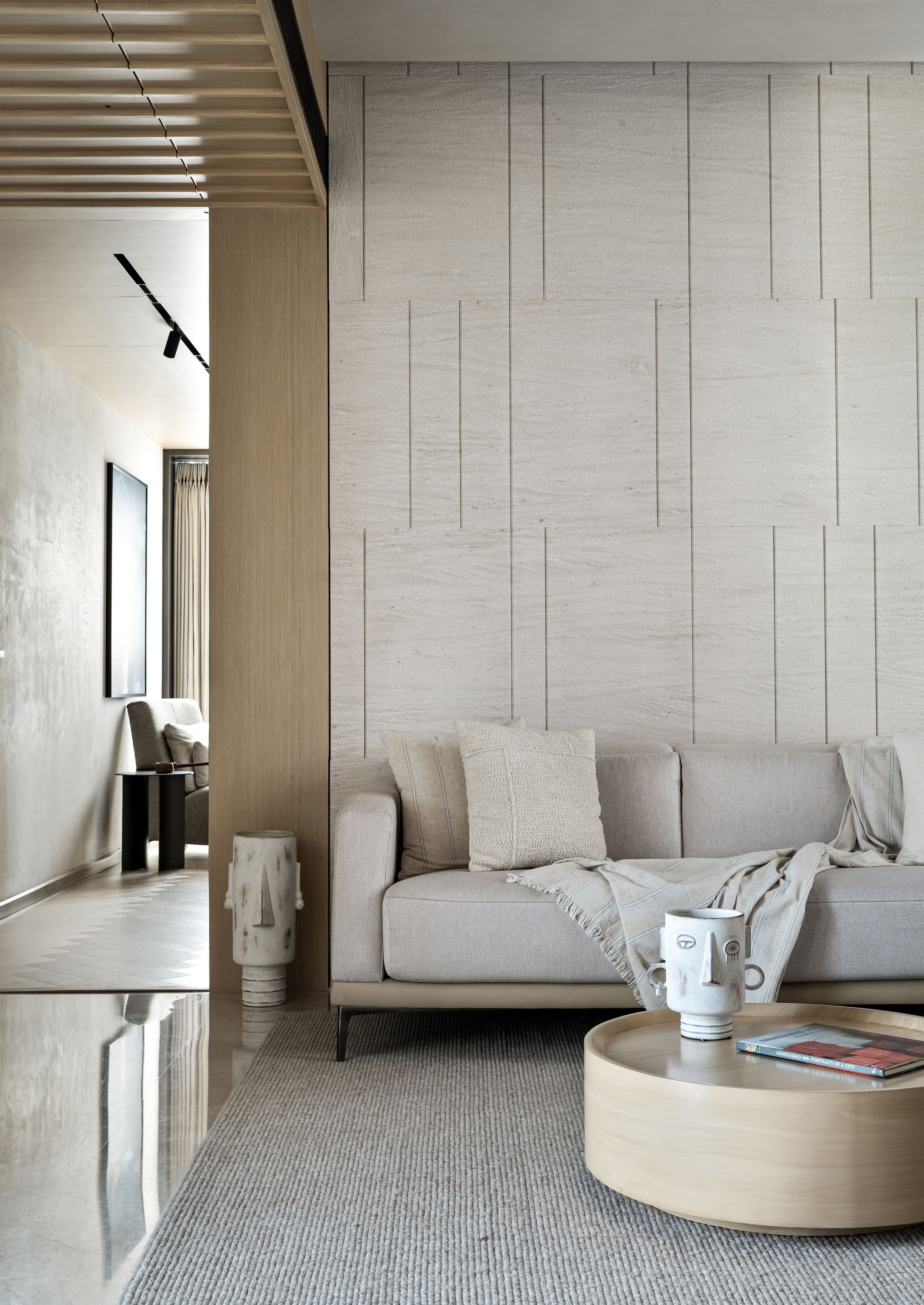
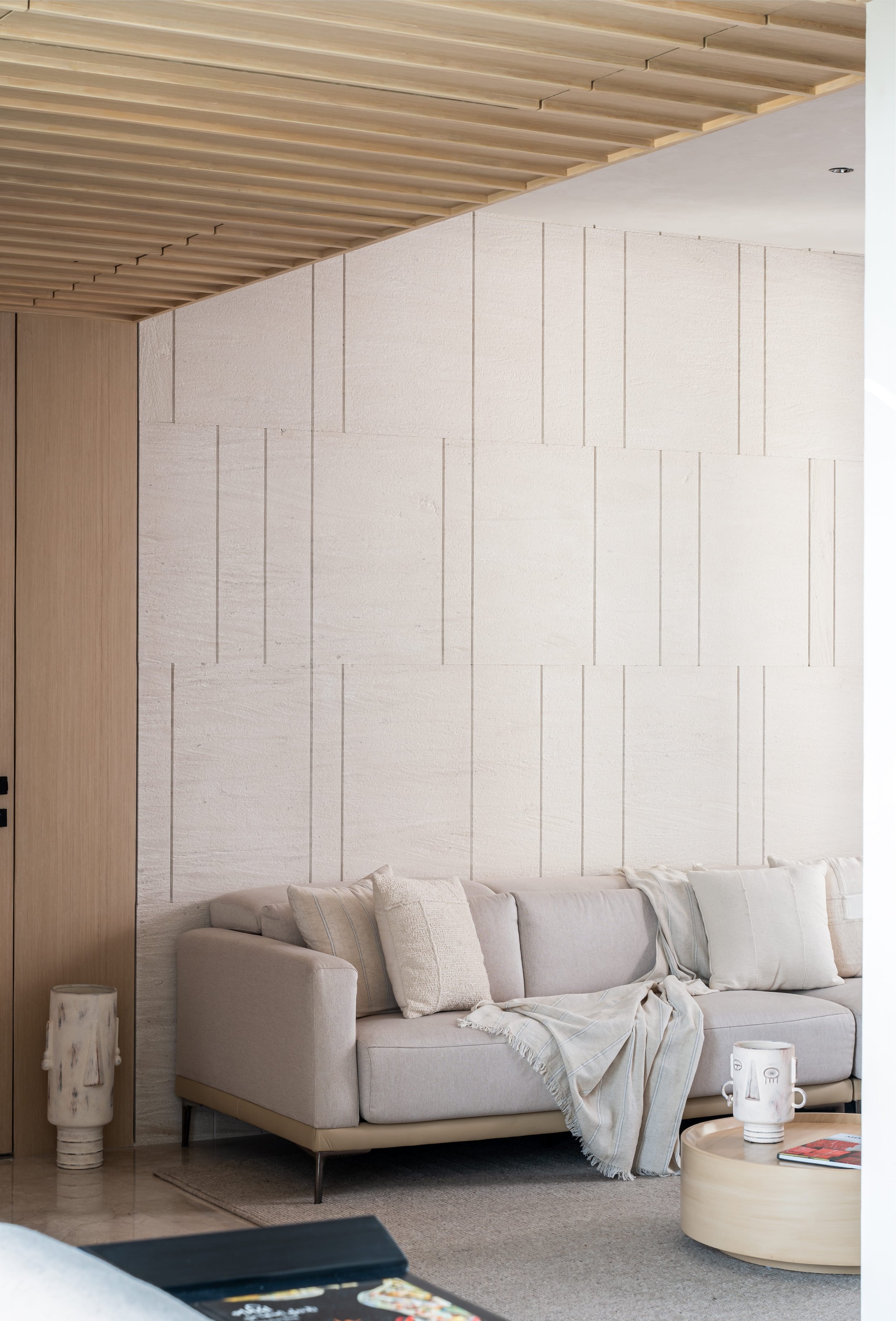
Bathed in monotones, the drawing room is emblematic of pared-down nuances. An interplay of warm white, beige, and light wood dominates the space, fuelling the free-flowing aesthetic. A slatted ceiling detail in lightwood guides one’s sight towards the room’s expanse, met by the natural white sandstone-clad focal wall. The beige sofa rests against this backdrop, accompanied by a textured rug and a circular coffee table.
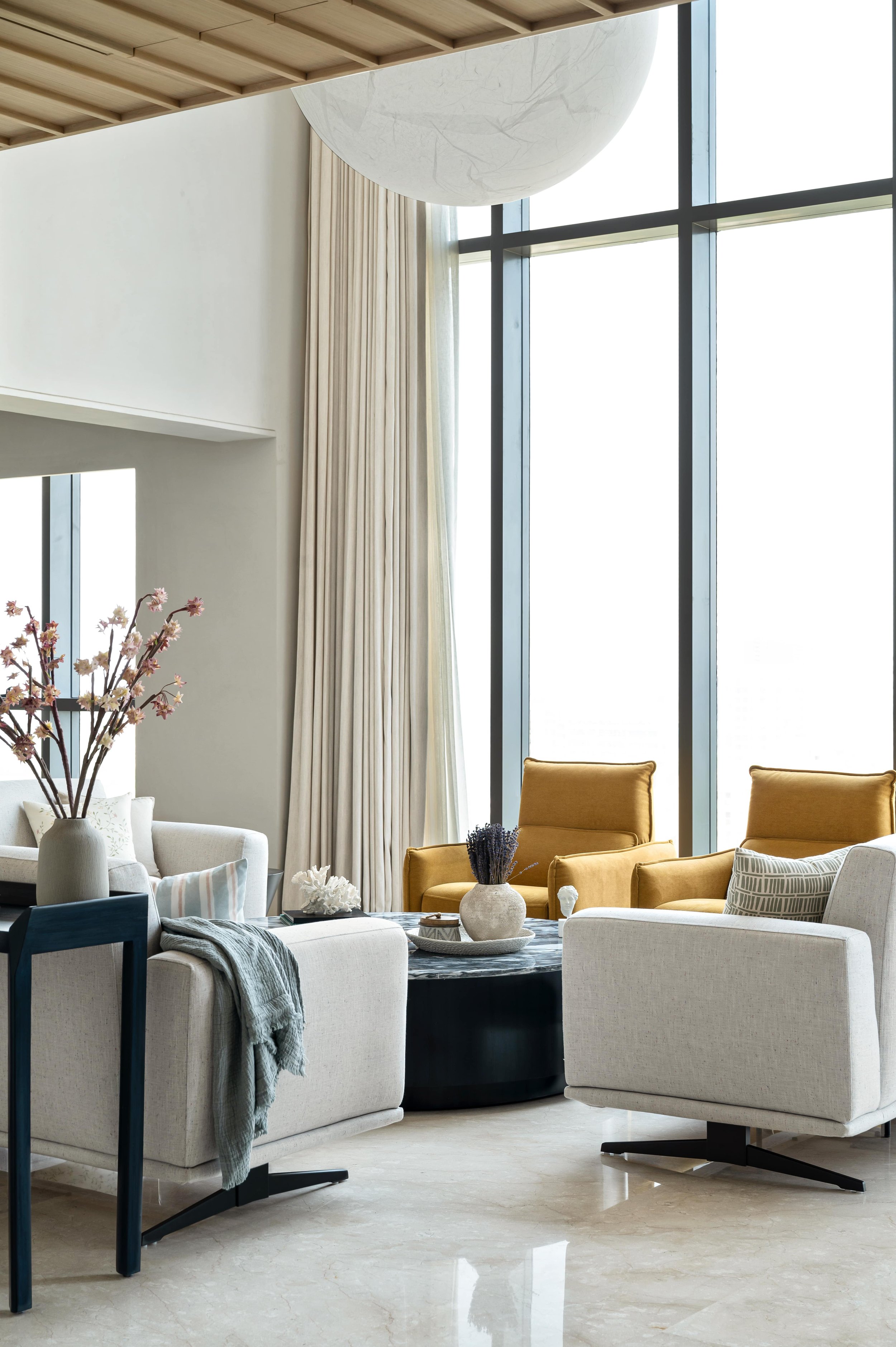
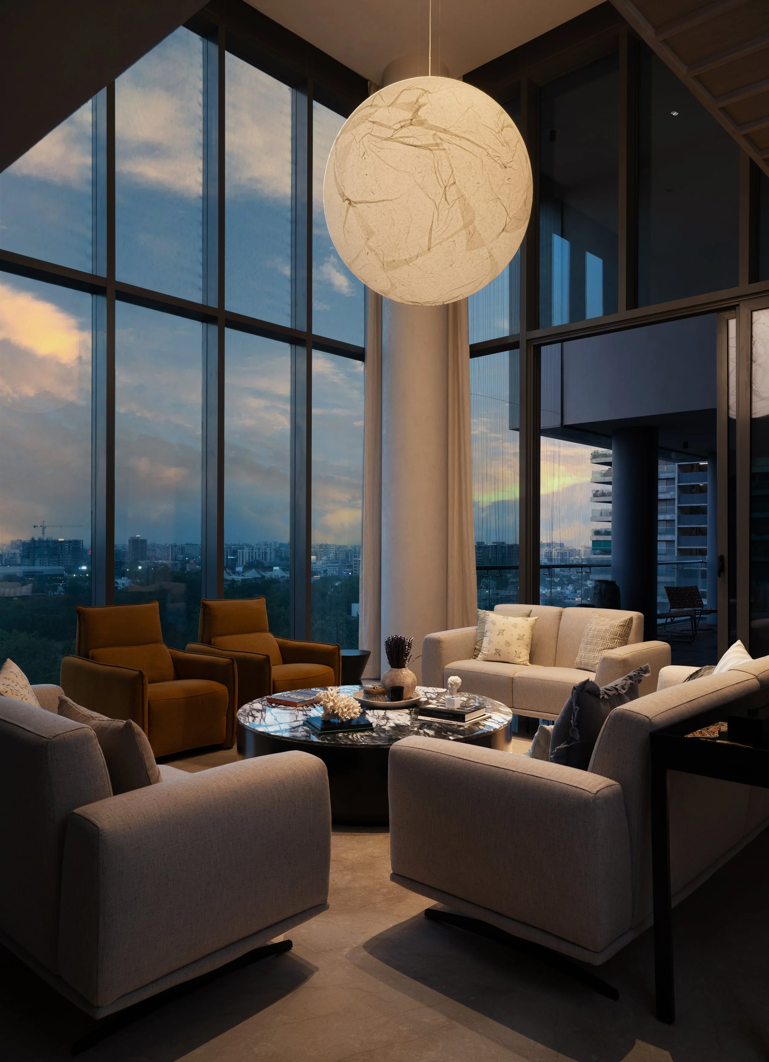
Fringed by colossal, floor-to-ceiling glass windows along two edges, the living room is the home’s nucleus, relished by the family and their loved ones! “The generous doses of daylight highlight the floor plan’s openness, allowing the views of the bustling city to permeate the indoors while brewing serenity,” she expresses.
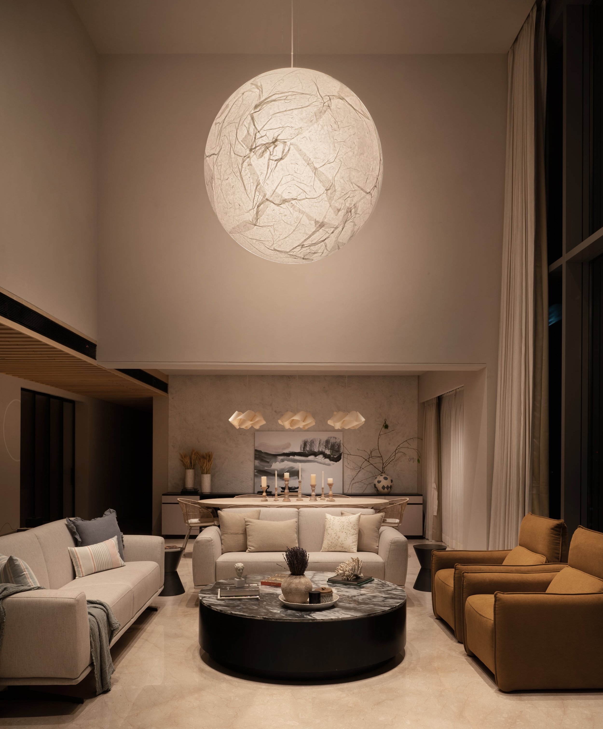
Cool and warm tones of greys and ochre unite harmoniously, lending the sumptuous furniture character. The sofas and armchairs organise themselves around the massive black marble coffee table (adding a dash of contrast), creating an intimate milieu for conversations or quiet reflection.
The muse of the space is the ‘Moon’ light by Davide Groppi, crafted in traditional Japanese paper. The installation-like fixture emanates a diffused, gauzy light into its surroundings, creating a soulful vignette. The living space is transformed at dusk as the luminaire flickers to life, portraying an uncanny resemblance to the ethereal moon levitating in the night sky.
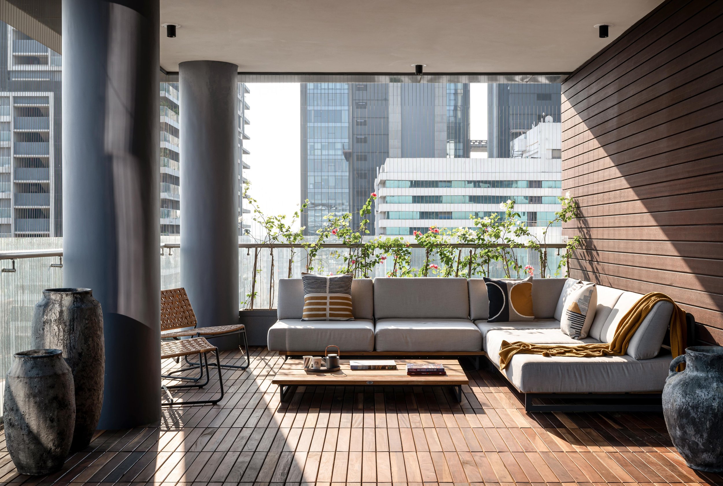
Sharing its threshold with the living, the balcony lends its canvas as an extension of the home, peering into views of gleaming skyscrapers. The home’s sentiment of rootedness is channelled through the clean-lined outdoor furniture, swathed in tones of grey, the low wood coffee table, and the steel and woven PE strap chairs. An envelope of fuchsia and white bougainvillaea creepers emerge from the balcony’s edge, endowing this alfresco oasis with a layer of seclusion.
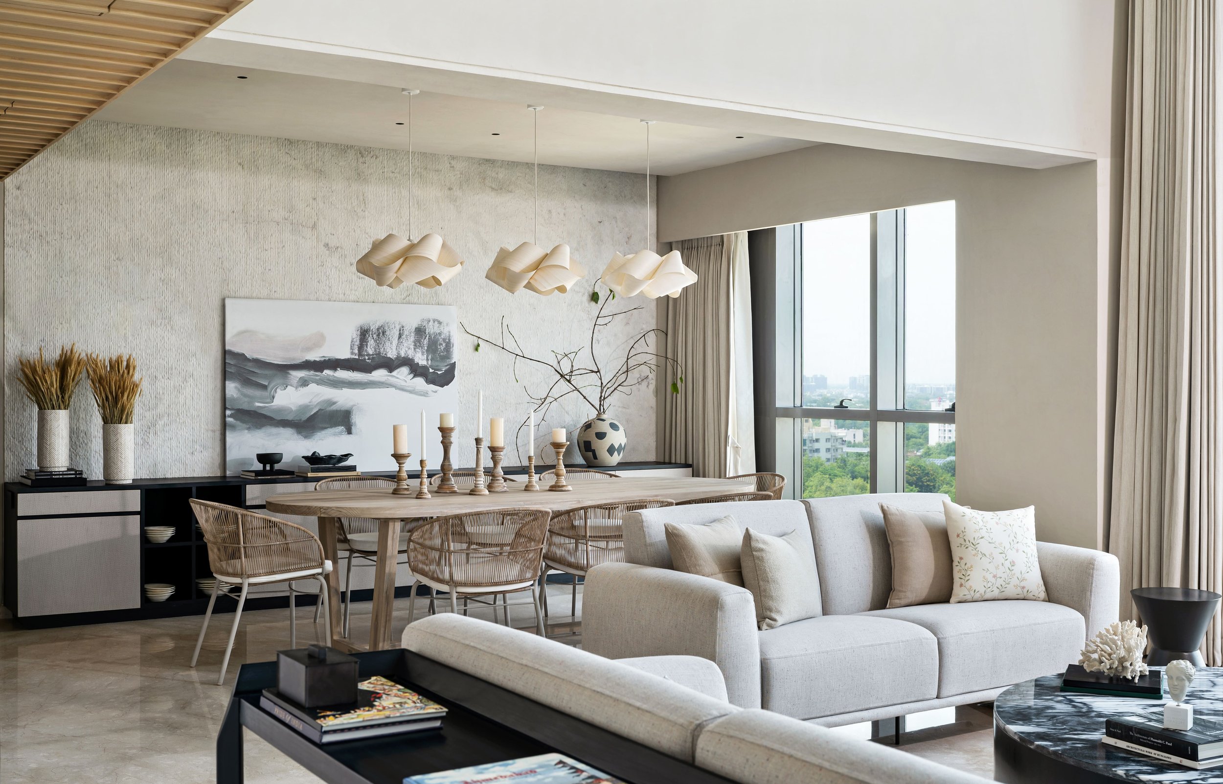
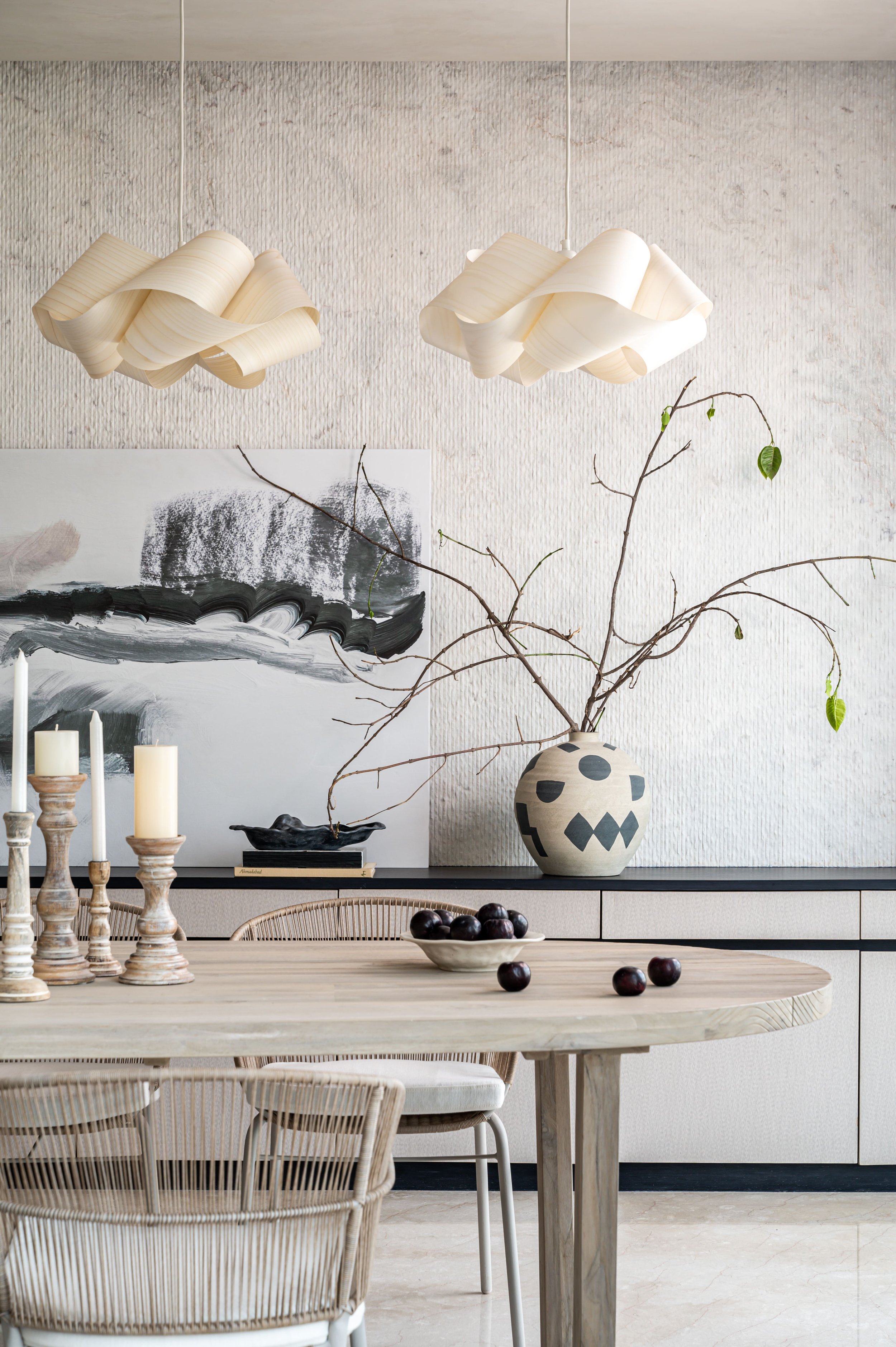
Situated adjunctly to the living space, the light-washed dining area creates an inviting atmosphere and comfortably seats eight. Exuding tactile finesse of Japandi design, this part of the home hosts myriad textures that play the role of storytellers. The oval reclaimed teak dining table celebrates the wood’s grain and pairs harmoniously with the airy, handwoven rope chairs. A trio of contorted, wood veneer pendants claim the atmosphere over the dining space, layering the ambience with inherent warmth.
The background comprises a serrated, white marble variety that instantly renders the space with a layer of depth. A running console with open and closed segments occupies the perimeter of this wall, adding to the coexistence of contrasting tones. A prominent piece of modern art graces this nook with fluid strokes that borrow colour from the space’s visual palette.
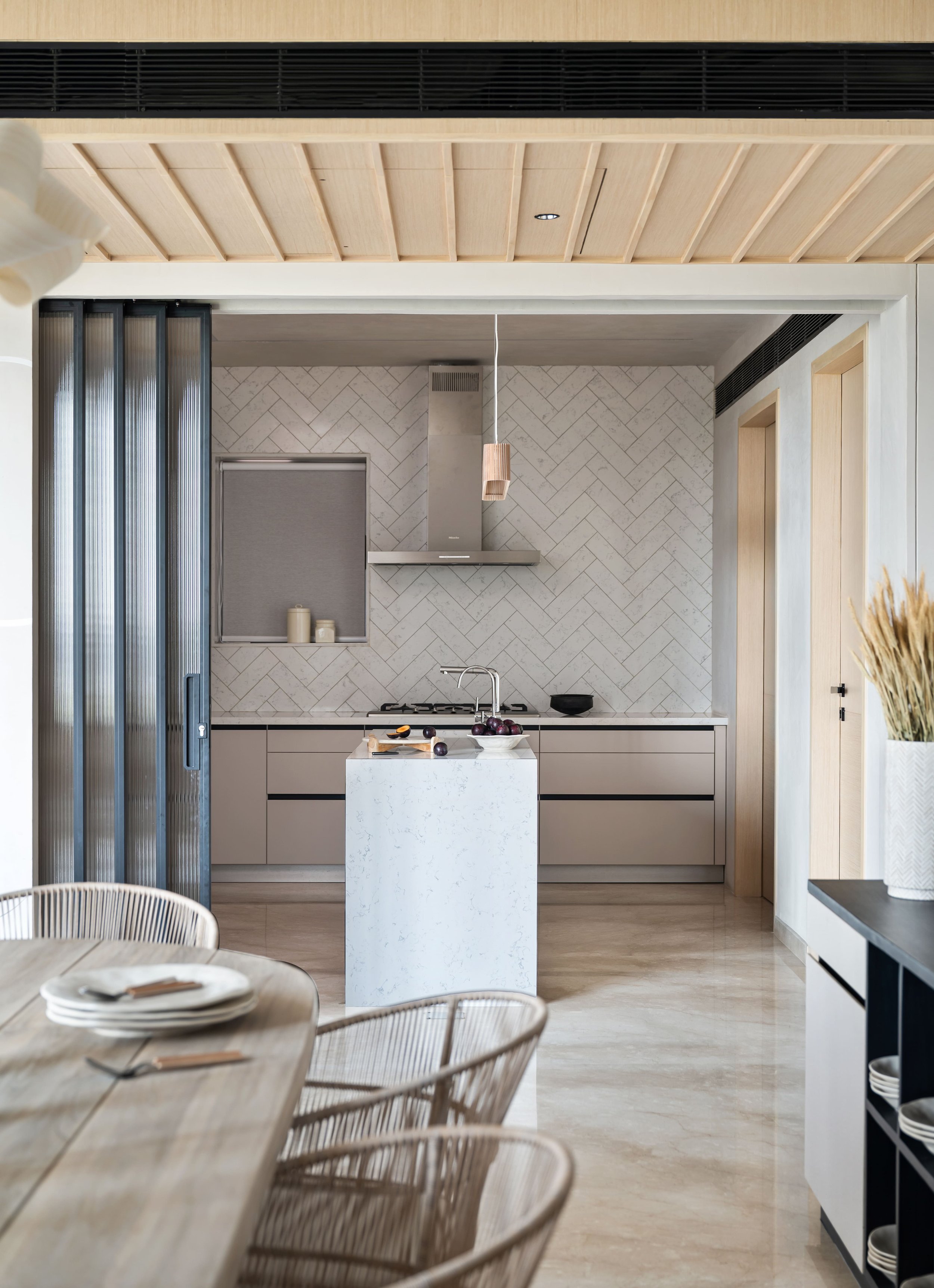
“Repose and elevated functionality take centre stage in the kitchen connected to the open floor plan through sliding metal doors infilled with fluted glass. This feature allows us to connect the kitchen to the larger blueprint, especially while hosting, or cordon off the space on a whim while preserving the passage of natural light,” illustrates Kavisha.
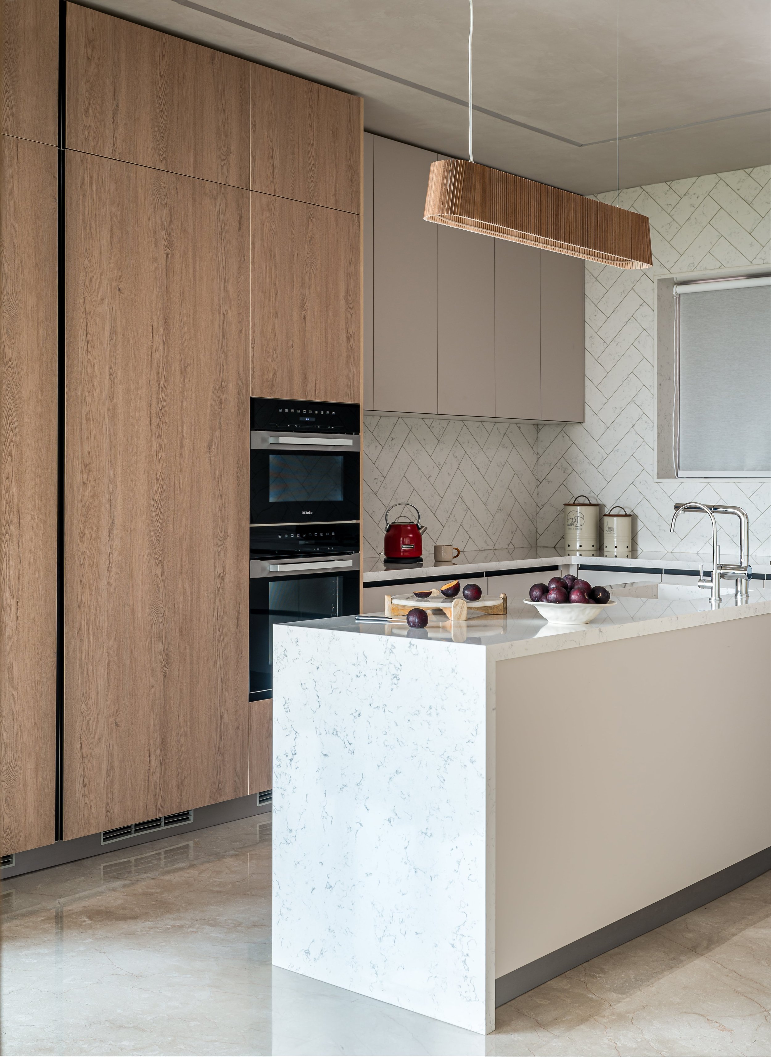
The countertops and backsplash are made in nebula white quartz, wherein the latter arranges the stone in a herringbone configuration to introduce dynamism. The hardware-free cabinetry allows the wood’s texture to assume the spotlight. The central, linear island organises the kitchen’s flow, offering the users an additional surface crowned by a handmade, slatted birch light fixture by Secto Design.
A space used by the couple to tend to their remote work schedules and often to relish in a moment of quietude, the study has been created in an area that was a former bedroom. “Positioned along the edge of the passageway, the study is earmarked by an assembly of shoji-style doors. The traditional Japanese design feature has been recreated through modern materials, a slatted black metal framework and clear glass. This enables light to suffuse the erstwhile dimly-lit passage, giving the study an added perception of privacy,” describes Patel.
A medley of cool and warm greys claims the room, creating a visual transition. An inset nook in charcoal grey poses as a workspace, equipped with a dark-stained desk and overhead shelves peppered with curios. The room’s opposite side is adeptly designed to harbour open and closed storage, spotlighting the vertical grain of the wood and the dapper black hardware.
The pooja nook borders the passageway, making a discreet cameo that uninterruptedly ties in with the home's ethos. This space is sculpted wholly in a pristine Vietnam white micro crystal, portraying an intricately chiselled Shri Yantra composition over the walls and a solid platform below displaying the deities.
The powder bathroom displays a palette of materials ubiquitously spotted across the home. Awash in light-toned, textured veneer, this area houses a monolithic quartz countertop with a large, black metal mirror for contrast.

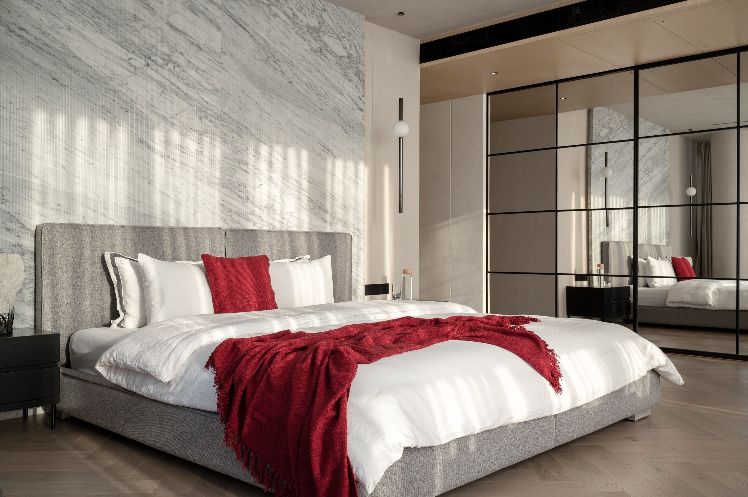
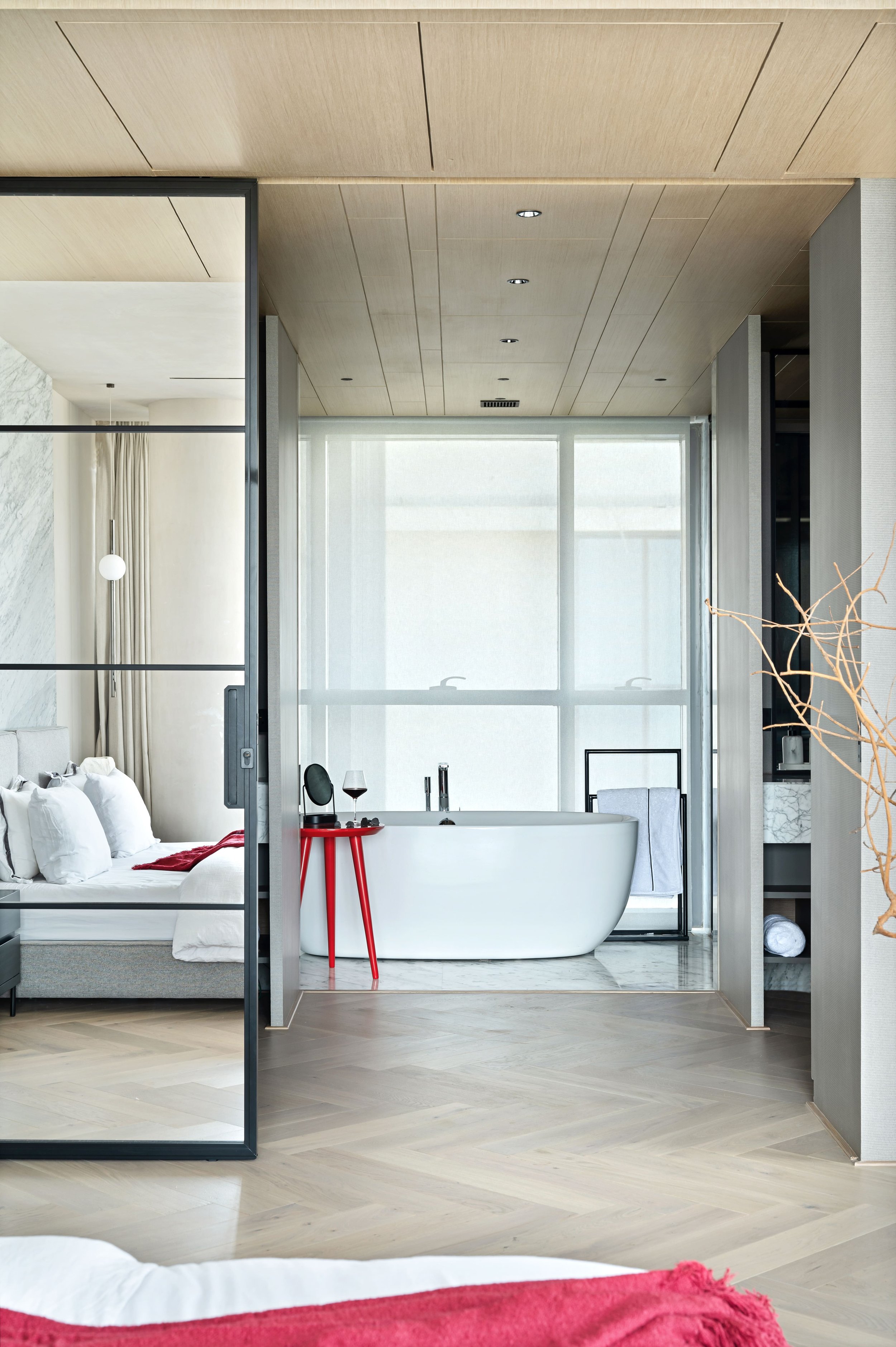
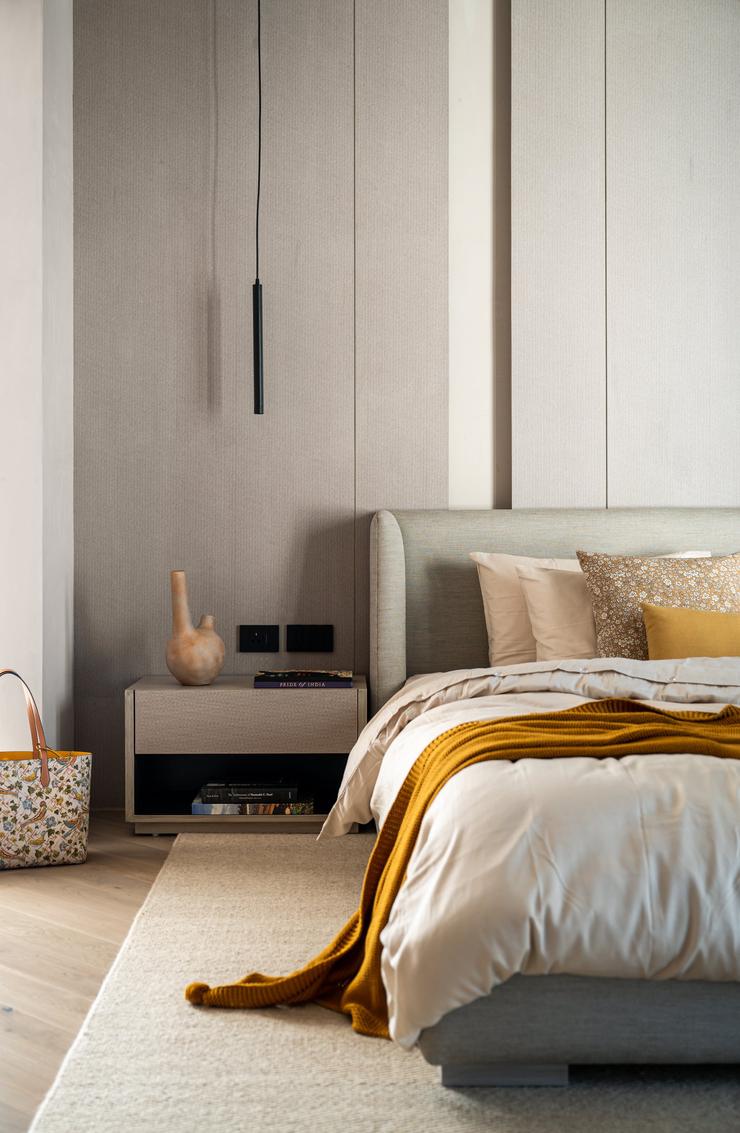
“Nestled with the embrace of two expansive glazed walls, the master bedroom is flooded with natural light, transforming playfully over the day. The medium-toned herringbone floors, lofty columns, and assorted neutral textures define the space visually. It is our haven in the truest sense,” Kavisha avers. The resting space anchors a grey upholstered bed, positioned against a fluted marble backdrop, its veining masquerading as art itself! A set of gunmetal, globed pendants suspended by the bedside radiate diffused light, making lighting an instrumental tool in elevating the room’s ambience. The master bathroom connects to the bedroom via extensive mirrored shutters, doubling the space’s visual volume and daylight. This reflective membrane reveals a profoundly-detailed sanctuary of ease. The bathroom is approached through a walk-in closet section flanking either side to the entrance of the bathing chamber. A soft grey marble sheathes the floors and walls, bestowing the space with a seamless visual flow, focusing one’s gaze upon the free-standing bathtub.
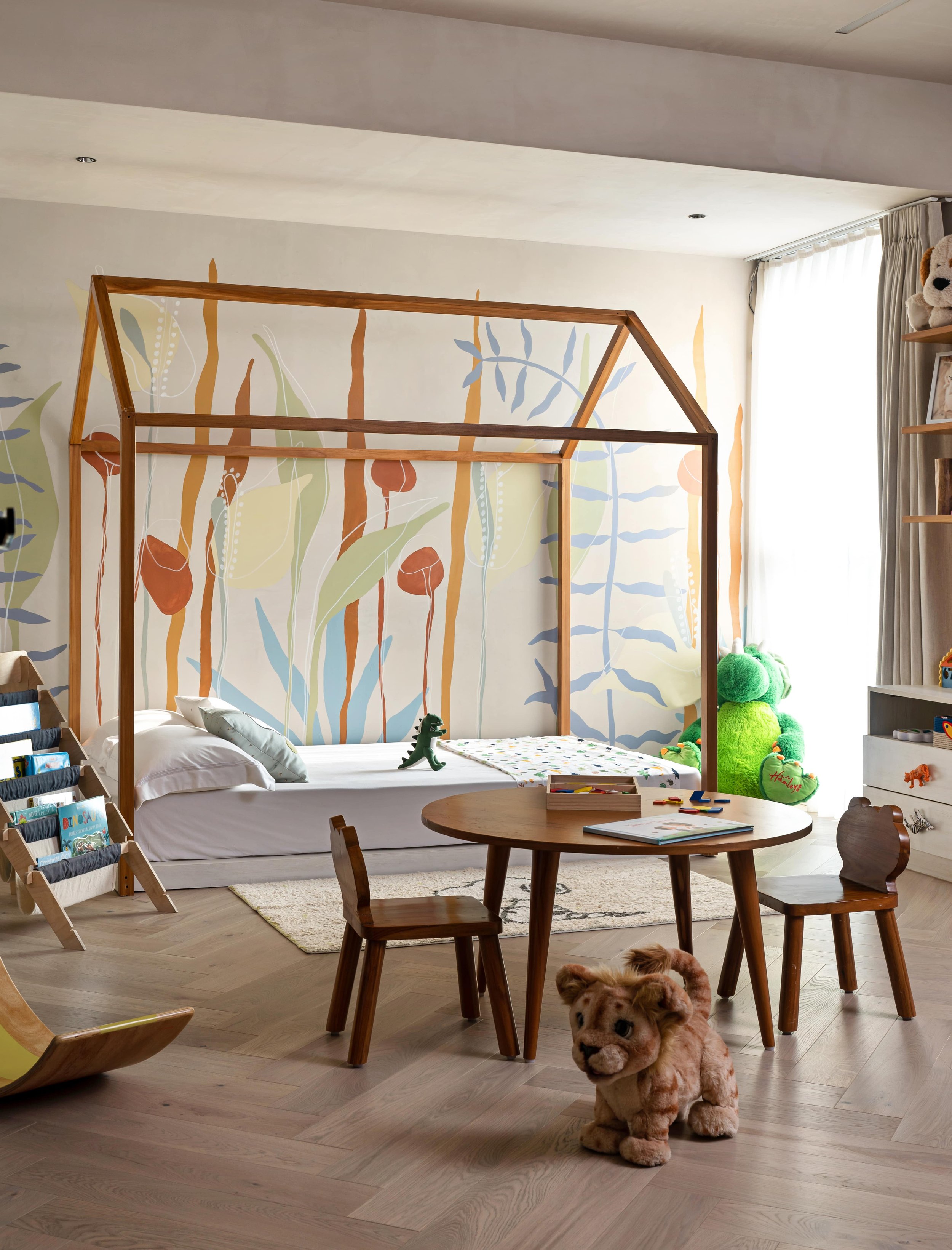
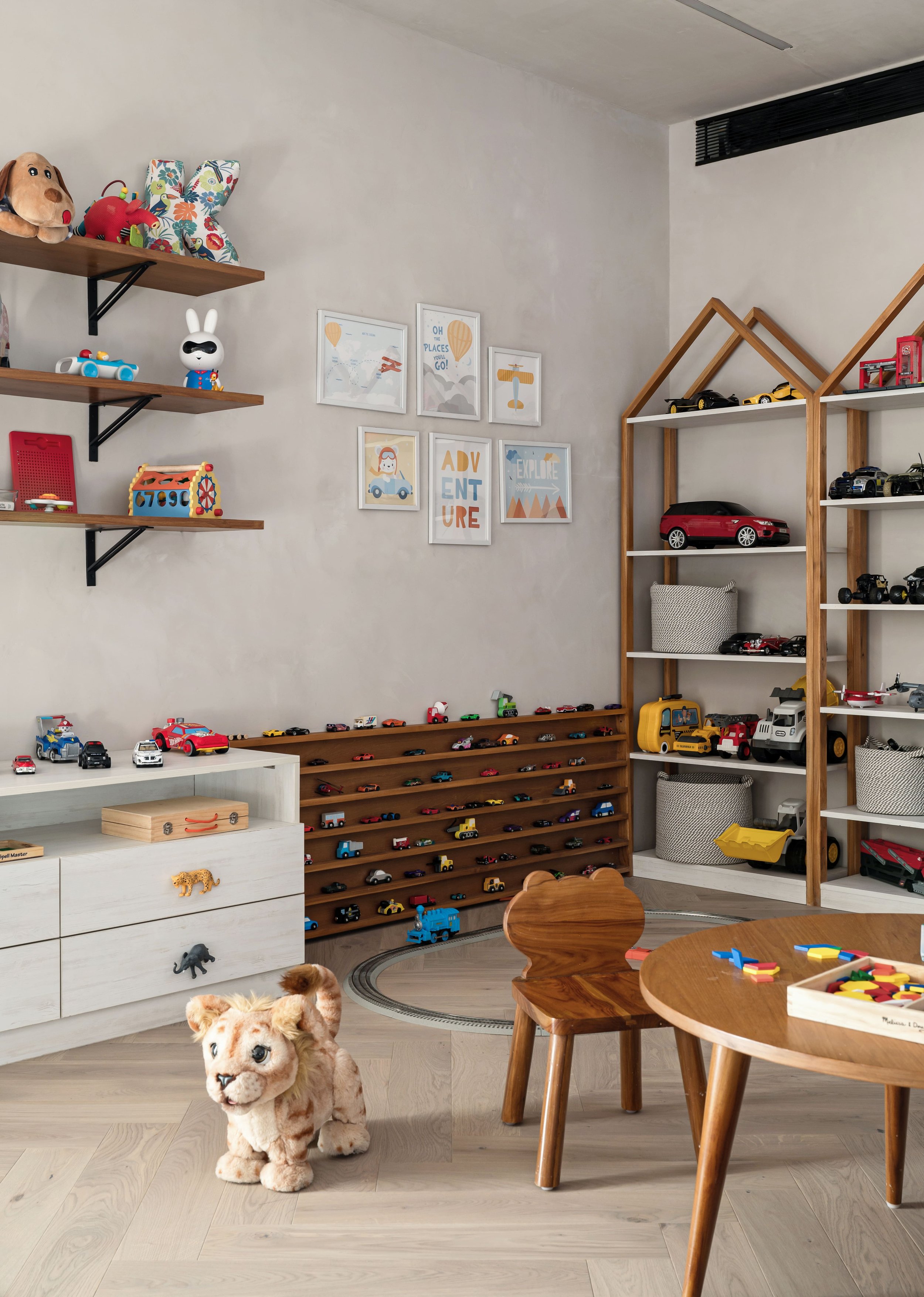
The child’s bedroom is a space designed by Patel with a future-centric approach, harnessing the potential to change with her son’s morphing needs. “The environment focuses on the cornerstones of Montessori education, entailing hands-on learning and self-directed playtime. I’ve envisioned the space to have umpteen low-height storage inserts so he can organise and access his belongings independently. We wished for him to be able to make this room truly his own, with this being the primary canvas,” she adds.
The room harbours diverse yet integrated zones to address the young user’s needs. A pitched-roof low bed sits against a hand-illustrated mural in vibrant hues, creating a fantastical backdrop. A centrally-positioned crafts table creates an engaging zone for him to get creatively busy. The running, open shelves, consoles, and pitched-form wall storage create pockets of display peppered with the child’s loved toys and objects, organically injecting colour into the bedroom.
The guest bedroom at North A11 cocoons its inhabitants, extending the sentiment of balance and comfort. The slightly low-height bed embodies a feeling of being grounded, finished wholly in a soft grey fabric. The nightstands are simple cuboids, nodding to the modernist pulse of Japandi design. A textured Italian veneer clads the backdrop to the resting space, adding a sense of extended volume. By the window, a set of comfy armchairs frame an abstract artwork which layers this corner with slivers of hues.
“We spend a large fraction of our lifetimes as design professionals dreaming up the perfect space for people to call their home. Being on the other side of this process felt soulful, challenging, and gratifying on many fronts! We were able to view the notion of our home from a personal lens, and now it feels like inhabiting a retreat that we feel so strongly bound to,” smiles Kavisha in conclusion.


