Peninsula 10
Design Firm: Enviarch Studio
Principal Architects: Shravan Pradeep and Megha Nanaiah
Location: Bangalore, India
Project Typology: Residential
Photographer: Yash R Jain
Chronicling the depths of rooted heritage and a contemporary essence, Peninsula 10 is a secondary residence for a couple in Bangalore that embodies innate warmth, raw materiality, and craftsmanship with candour.
A rooted sense of tradition and a contemporary persona coalesce with sheer sincerity within the walls of Peninsula 10. Located on the tenth floor of a high-rise residential community in JP Nagar – Bangalore, this home conceptualised for the Bhat’s poses as a secondary abode to host them and their loved ones over their frequent visits to the metropolitan.
The design brief underscored the client’s desire to inhabit a minimalist and classic-souled abode that would be ideal to dwell, unwind, and host within. The focus pivoted around the creation of a bespoke medley of spaces, layered with intentional inserts that narrate a saga of their way of being, all while making for an inviting home that could be enjoyed by their family, grandchildren, and friends.
“With Peninsula 10, the catalyst while envisioning the residence was to delve into spaces with a curatorial spirit. The Bhat’s had a resoundingly clear vision, laying an overarching emphasis on one-of-a-kind elements becoming the leitmotif in the home. Run-of-the-mill objects and pieces were off the radar, and that sentiment had a moulding influence on our creative endeavours,” shares Megha.
The light-flushed apartment’s blueprint affords the communal and private segments of the space ample exposure to daylight as morning transcends into dusk. The bare shell of the residence was handed over to the studio, with beige Italian marble pervading the home’s public spaces. The zones were designed in tandem with the pre-existing neutral palette of the floors while conjuring an inherently warm milieu that entwined a modern yet classic design grammar.
“The intention of representing simplicity in design dons a newfound role as a protagonist in the home. We’ve interpreted this notion as untainted materiality, celebrating the raw and native texture of finishes. The functional additions of storage and furniture have been designed in a renewed light, endowed with an almost sculptural presence that layers the space,” adds Shravan.
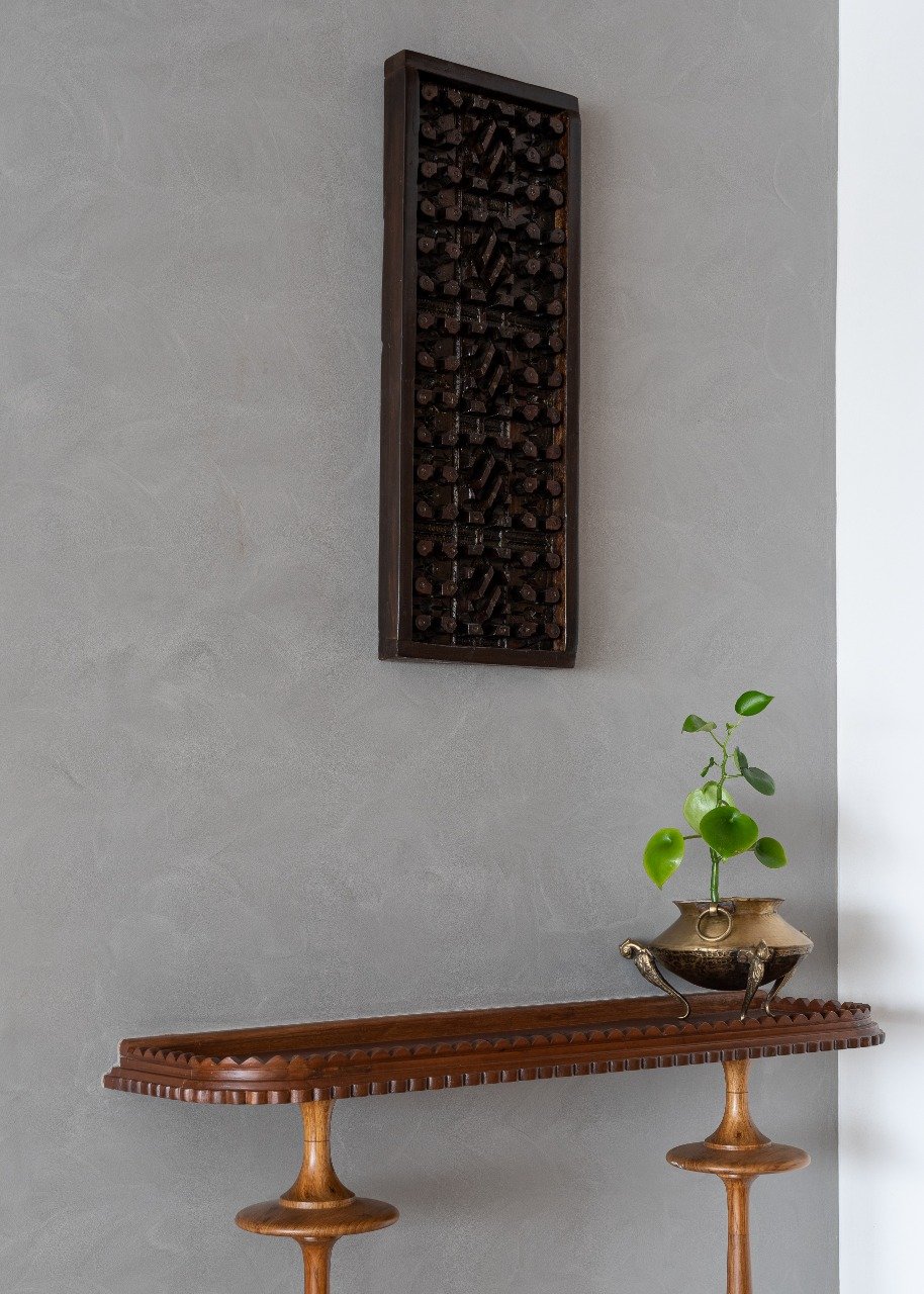
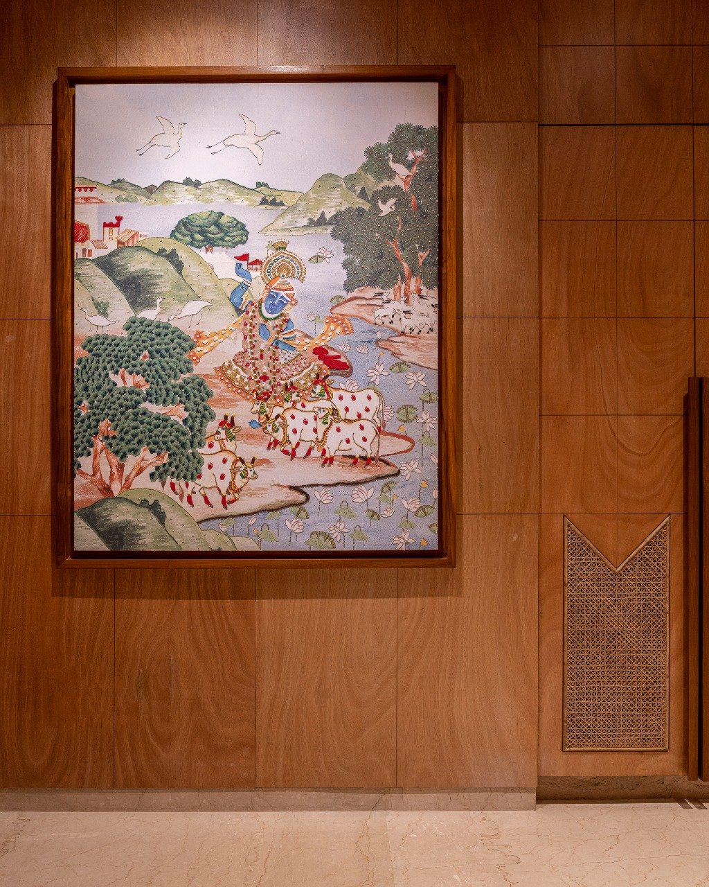
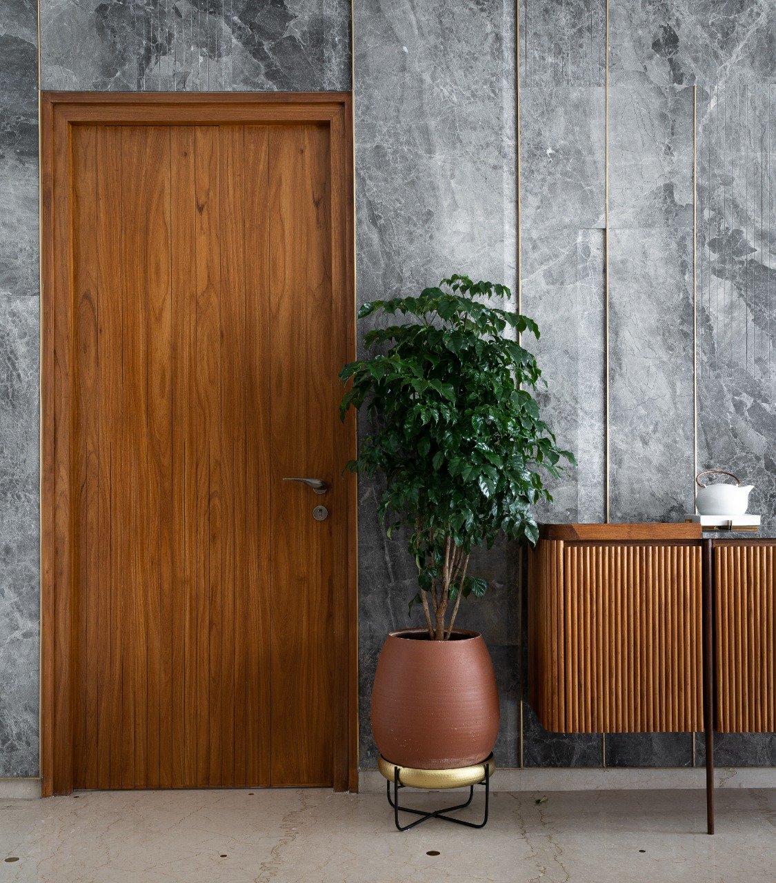
The apartment is approached via a private lift which unfurls into a series of foyer areas. The primary foyer is homogeneously sheathed in a brilliantly grained warm veneer, manifesting within the space as a grid of grooved panels. A custom artwork depicting Krishna in Vrindavan by Yamuna’s riverfront was illustrated by Kalakaari Haath, imbuing the area with an ingrained sense of heritage with the first rendezvous. Leading into the living space, a petite corner has been fashioned to pose as a vestibule, earmarked by an artisanal teak-bodied console with a reclaimed top juxtaposed against the all-embracing greys of the walls.
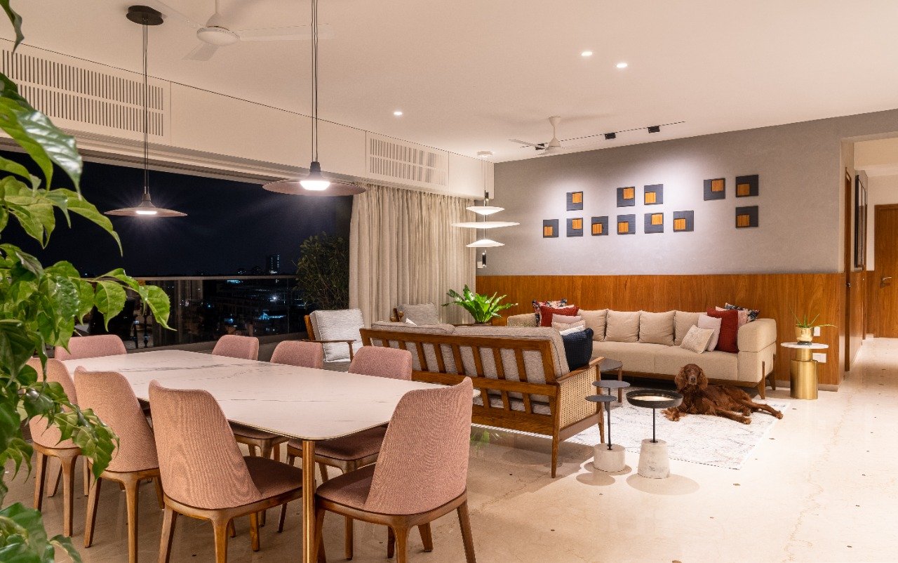
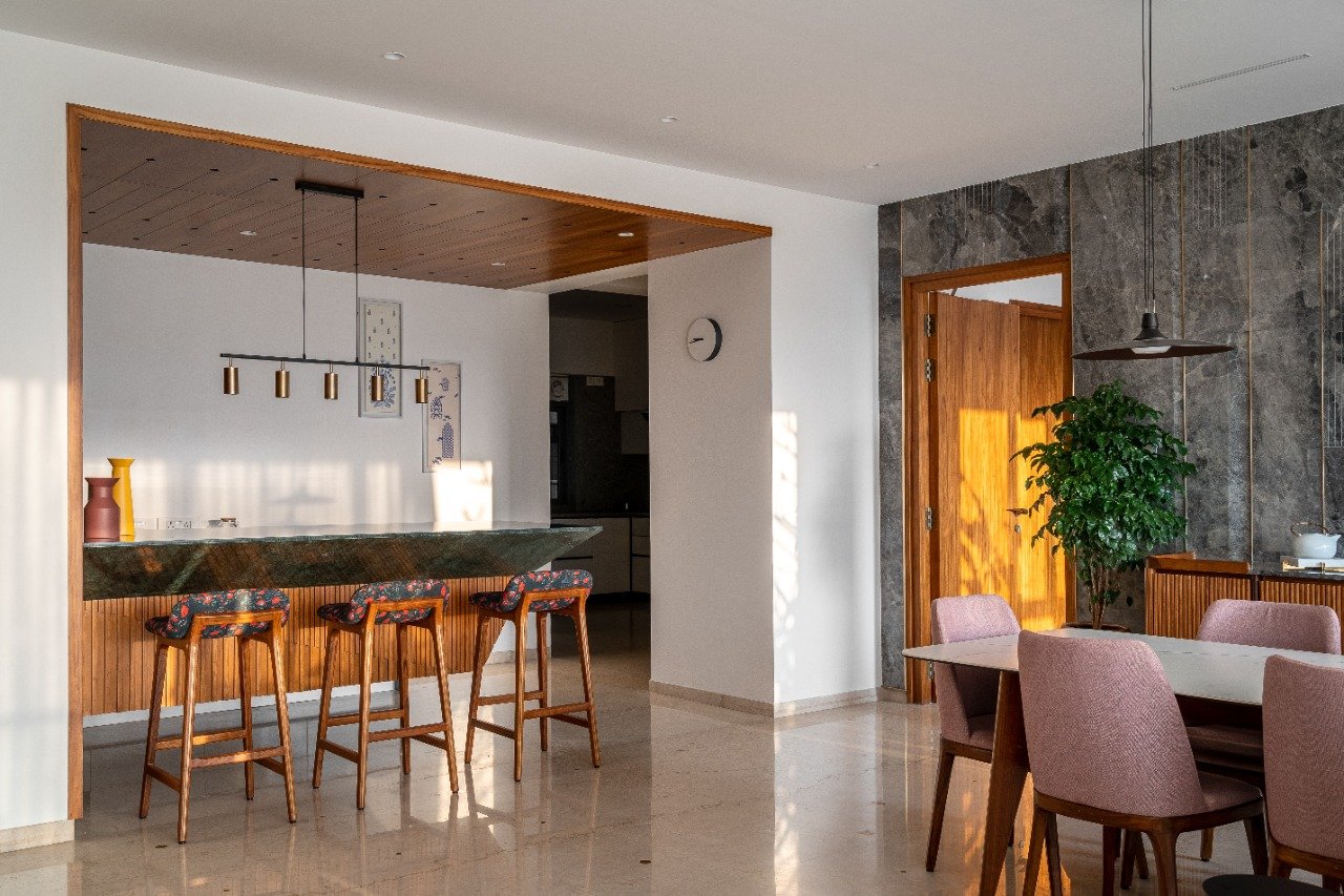
The communal nucleus of the home consists of the expansive living area, dining space, breakfast counter, and a peripheral deck which draws ample sunlight into the layout while framing panoramic views of the city. “The marble flooring stitching together this triad of spaces has been given a minimalistic facelift with a matrix of brass inlay dots that bespeckle the floors, playing up visual dynamism. Moreover, we have ensured that the core furniture at Peninsula 10 is far removed from being strictly utilitarian in its purpose. Instead, each bespoke piece has a unique aesthetic value attached to it, posing as objects of art,” explains Nanaiah.
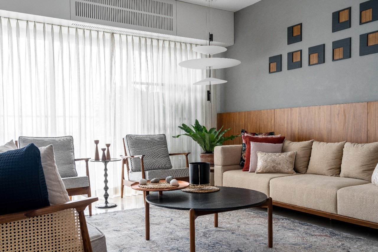
Suffused with umpteen daylight, the alfresco deck-flanked living area epitomises the indoor-outdoor living experience while hosting or merely having a spot to wind down. The textured grey walls are bookended with wooden panelling, creating a desirable dichotomy between cool and warm tones. Dabbling in overruling neutrals, the space comprises a sumptuous beige sofa and a pair of upholstered grey, wood, and woven cane armchairs by Magari, which hint at a Mid-Century Modern inclination.
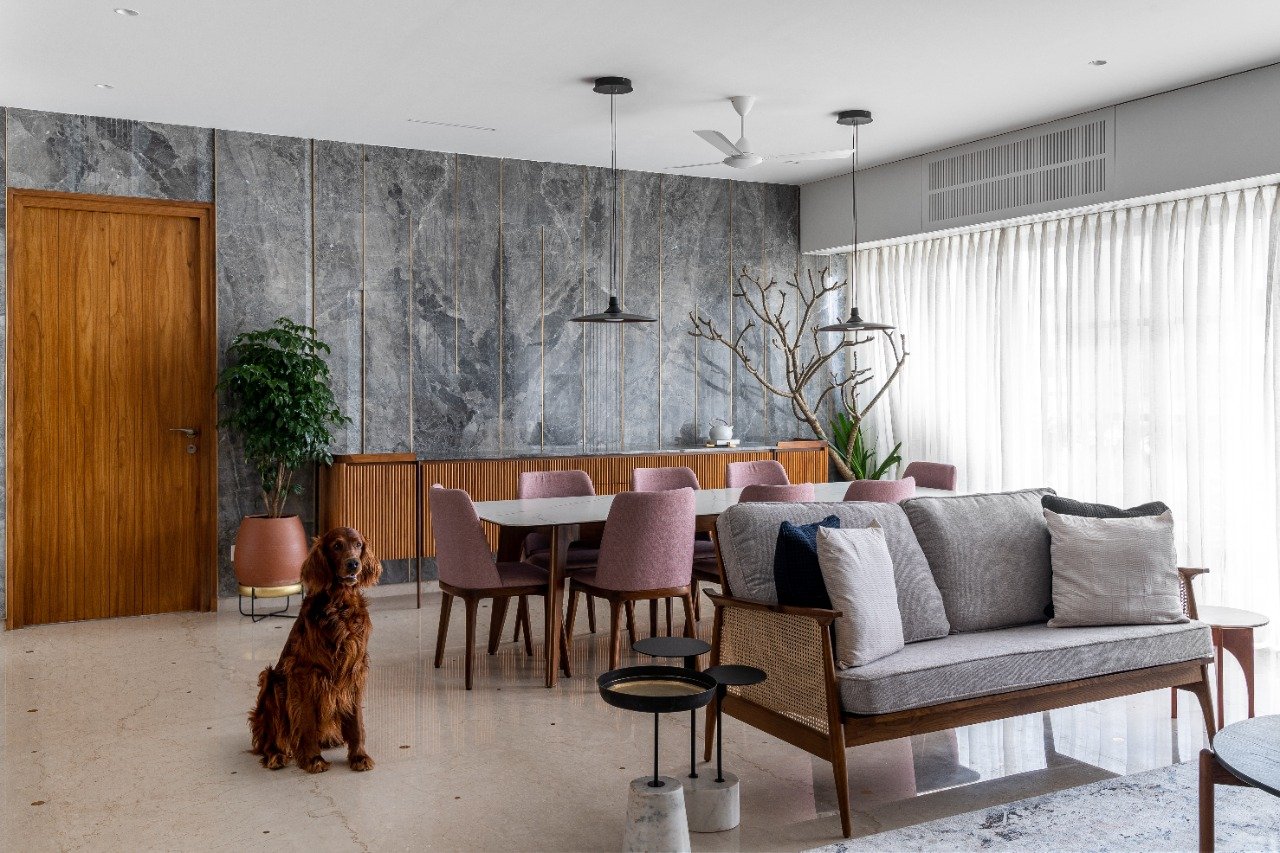
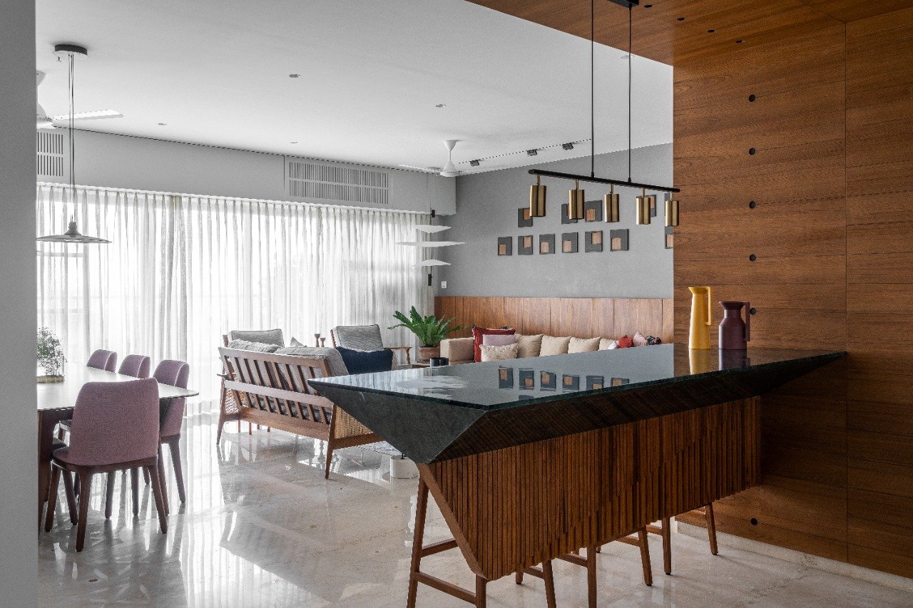
A hand-knotted carpet by Carpet Kingdom visually ties the space together, emphasising that neutrals rule the roost. Inspired by natural materiality, the tiered coffee table and end tables in the living space by The House of Things explore stones and metallic accents with fervour. A focal luminaire in the corner illuminates the area with a diaphanous light while engaging in a timeless monochromatic play. A montage of square forms finished in a black hue and slivers of wood create an artistic geometric installation. Doses of indoor greenery dots the spaces with verdure, connecting them to the outside seamlessly.
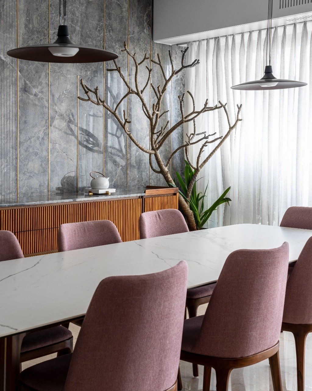
The dining space has been visualised against a handcrafted feature wall, layered with grey Italian marble sourced from Marble Italia, which boasts of amorphous-form veining interspersed with grooved segments and brass inlay beading. A fluted fascia credenza stretches along the length of the space, lodged amidst canopying greens. The eight-seater white marble top and wood base dining table is paired idyllically with blush-hued upholstered dining chairs by RedOAK, which inject an accent of colour into the otherwise pared-down zone. A duo of black metal pendants illuminates the intimate dining area, building on the neoteric DNA of the space.
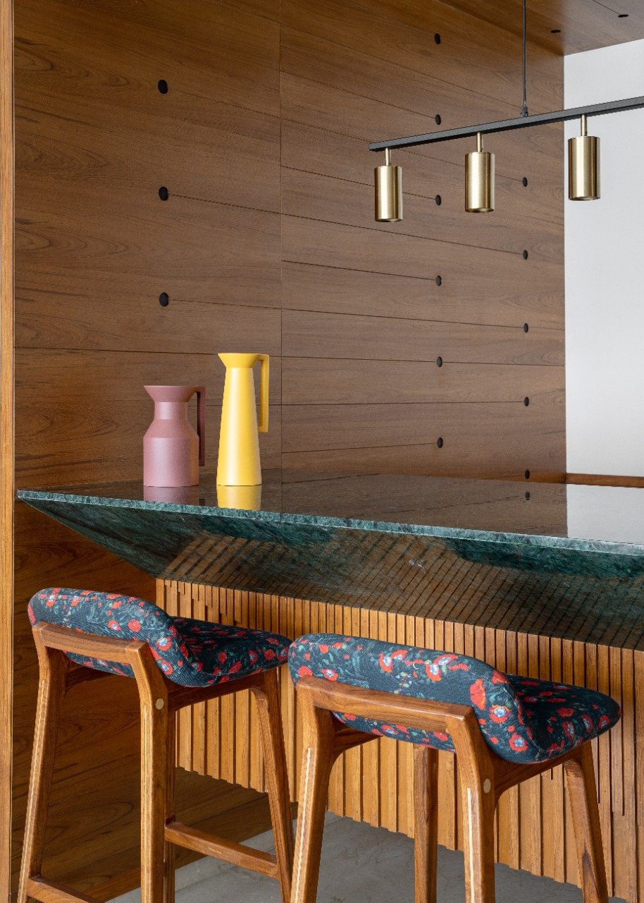
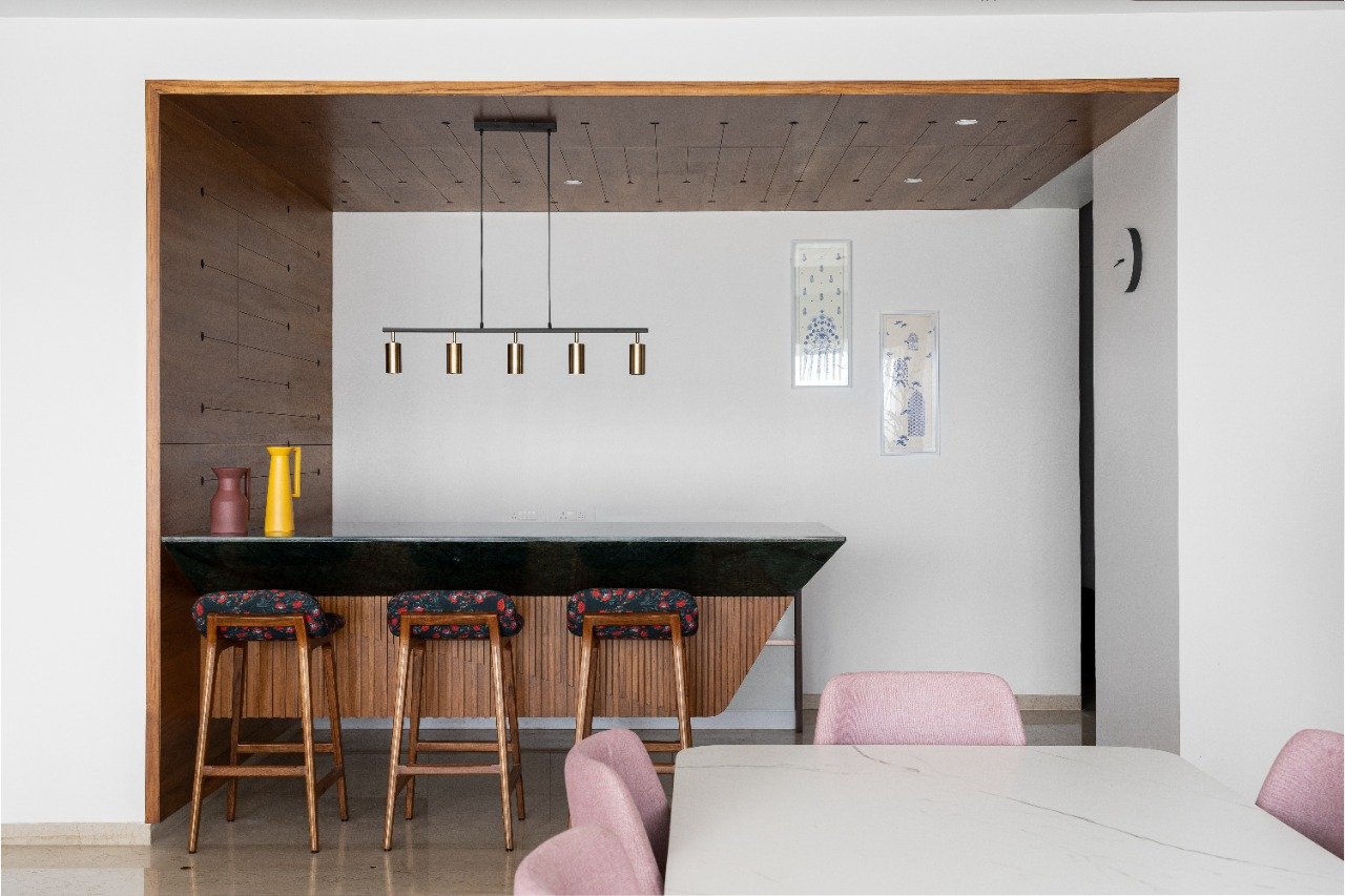
Snugly situated within a wood-lined alcove, the breakfast area acts as an interactive and functional extension to the larger public zones of the home. A wood veneer-lined segment washes over the wall and ascends to make its way across the ceiling, demarcating the zone discernibly. Levitating in a cantilevered manner, the breakfast counter makes for a sculptural addition to the space, stretching across the nook with its angular form as the pièce de résistance. The floral fabric-upholstered bar stool, black metal and brass multi-headed pendant, and capacious console towards the rear further build on its pragmatic and aesthetic features.
“The resolve was to create a light and almost dynamic ensemble with an individualistic presence within the quaint space. The internal metal framework has been crowned with a jade-green marble, and the base is clad in teakwood beading; both materials retained in their unadorned form,” iterates Pradeep.
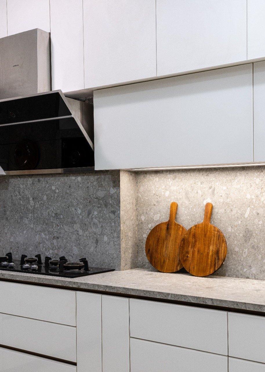
Preceded by a pantry area, the kitchen’s design ethos focuses on engaging a colour and material palette that elevates the visual perception of light, owing to the moderate sunlight that seeps inside. The employment of all-white cabinetry enables the space to seem larger and brighter, while the grey marble-lined countertops and backsplashes by Marble Italia create a grounded demeanour.
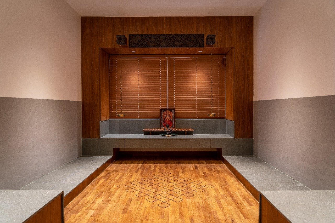
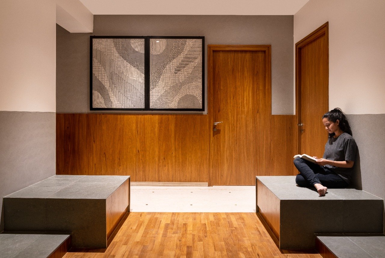
A modern interpretation that is also a homage to ritualistic traditions, the pooja room at Peninsula 10 was a space the client’s held close to their hearts; its conception needed to meld serenity and an Indianized vocabulary effortlessly. Swathed in teak hardwood flooring, grey Kota stone, rosewood, and brass inlay, the space is symbolic of repose. “The epicentre of their daily spiritual routines and a congregational spot during festivities, the pooja room is a new-age image of temple architecture. Multi-levelled stepped seating imagined in polished Kota stone aligns along the walls. The main sanctum pedestal has been kept afloat against the Venetian blinds, creating an obvious focal point under the artisan wall-mounted panels,” adds Megha.
The piers of the pedestal house ingeniously concealed storage. The floor's embedded rosewood and brass inlay detail depict a traditional Kolam, eternising the auspicious hand-drawn patterns. On the other end, monochrome diptych art adorns the passageway, revelling in the simplicity of the prayer area.
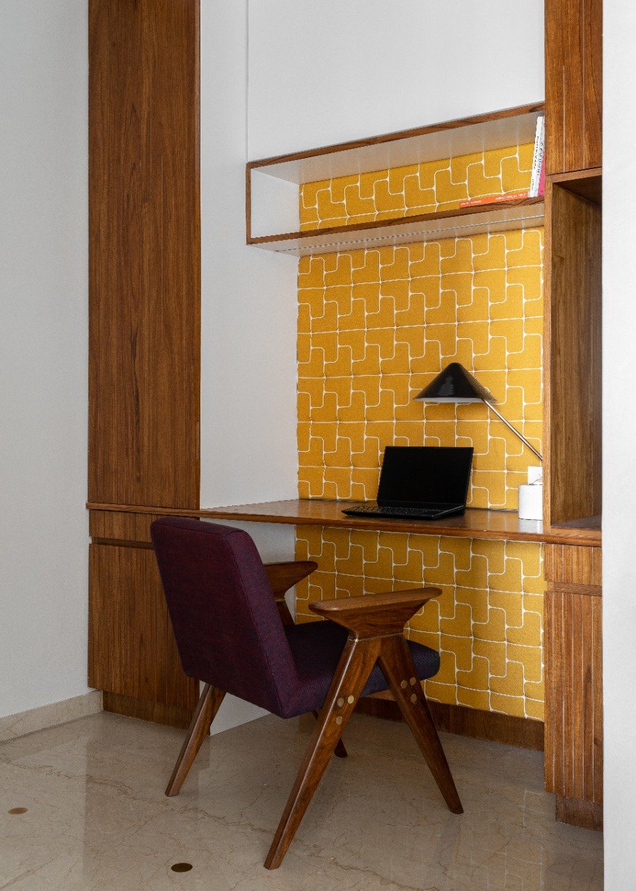
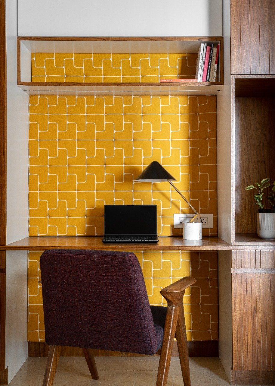
The home office is a hue-laden nook, a vision in ochre, accented by the deep purple Jeanneret-inspired chair. The compact corner has been devised to anchor symmetric storage cabinets that travel towards the ceilings with grooved shutters in wood. The central portion is designed to host a floating desk and open shelving backed by a sprightly ochre patterned wallpaper that adds zest to this corner along the axial passageway.
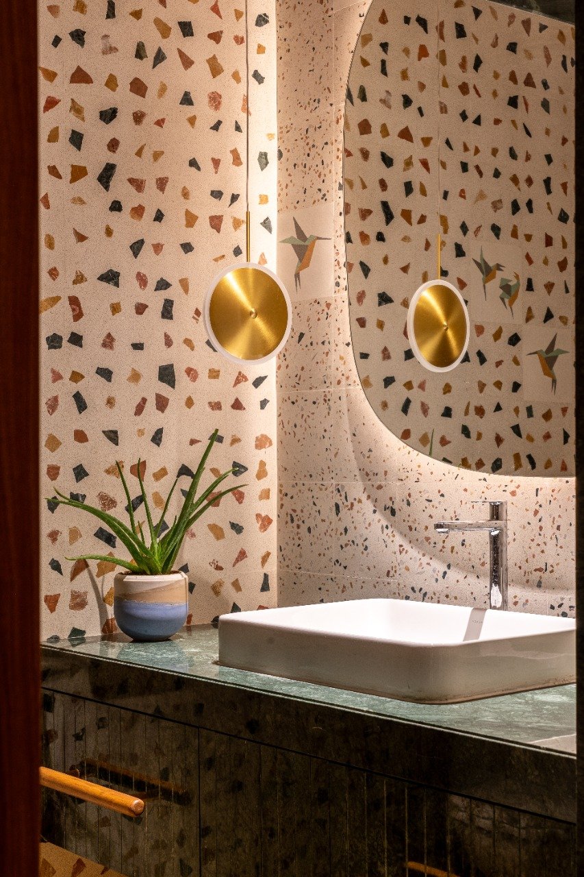
Bedecked in an interplay of earthy-hued terrazzo and avian motifs, the powder room witnessed a gut renovation involving tiling, fixtures, and cabinetry. The colourful assorted chips immersed in the terrazzo tiles by Bharat Floorings clad the walls, punctuated by origami-esque bird illustrated tiles that add character to the space. The floating vanity counter has been created in green marble, finished with grooved drawers. A gilded disk pendant and the backlit mirror brighten up the colour-speckled powder room.
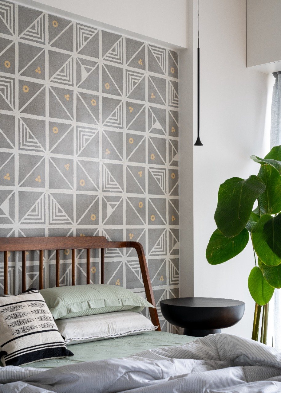
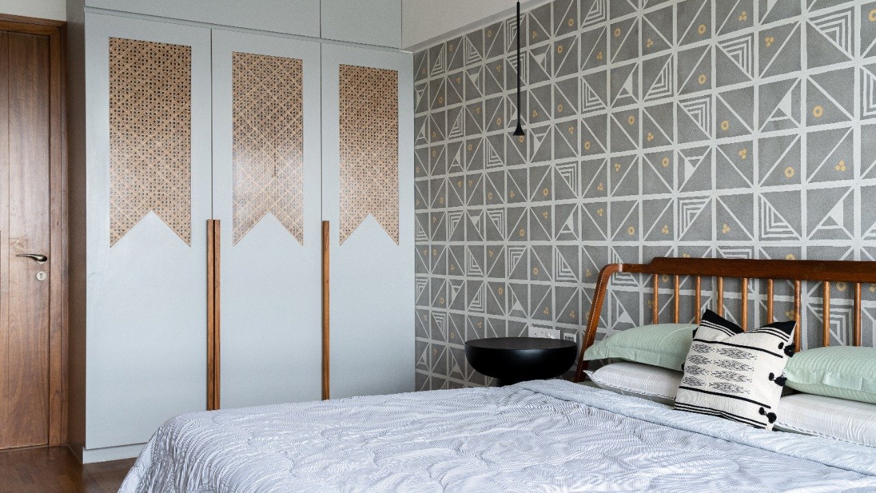
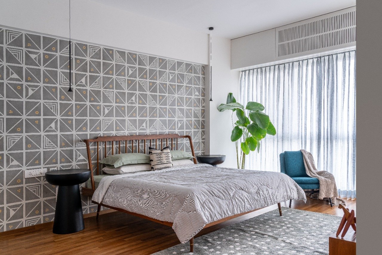
The private resting spaces at Peninsula 10 present themselves as organic segues to the home's harmoniously woven together public areas. The guest bedroom conjures a calm aura, pieced together with a concoction of greys and whites. The accent wall framing the resting area is veiled in a geometric collage of patterned cement tiles by Bharat Floorings, a coalition of colours that bleeds into the area rug by HummingHaus.
The angular spindled back teakwood bed, massive black nightstands, and a pair of minimalist suspended pendants levitate weightlessly, creating the central vignette. A teal armchair by the soft sheer blue curtains creates a dreamy reading corner under the fanning greens. The wardrobes in cool grey have been sandwiched with woven cane infills and long wooden handles. The television console on the other side ventures into a play of volumes, culminating in a tall cabinet in the company of tropical art and wall decals by Kalakaari Haath.
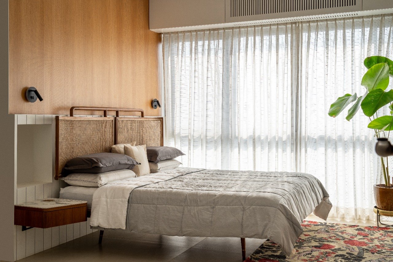
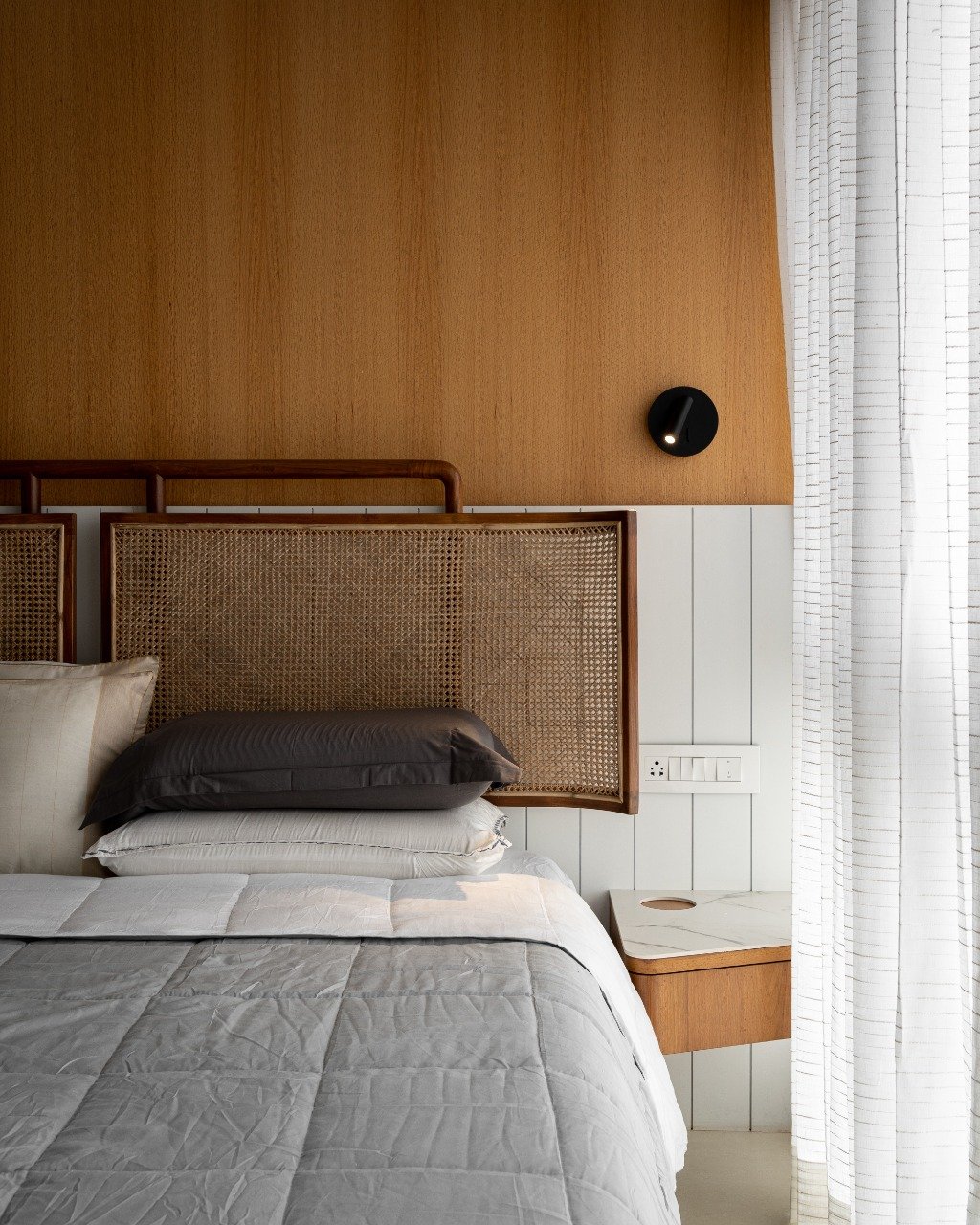
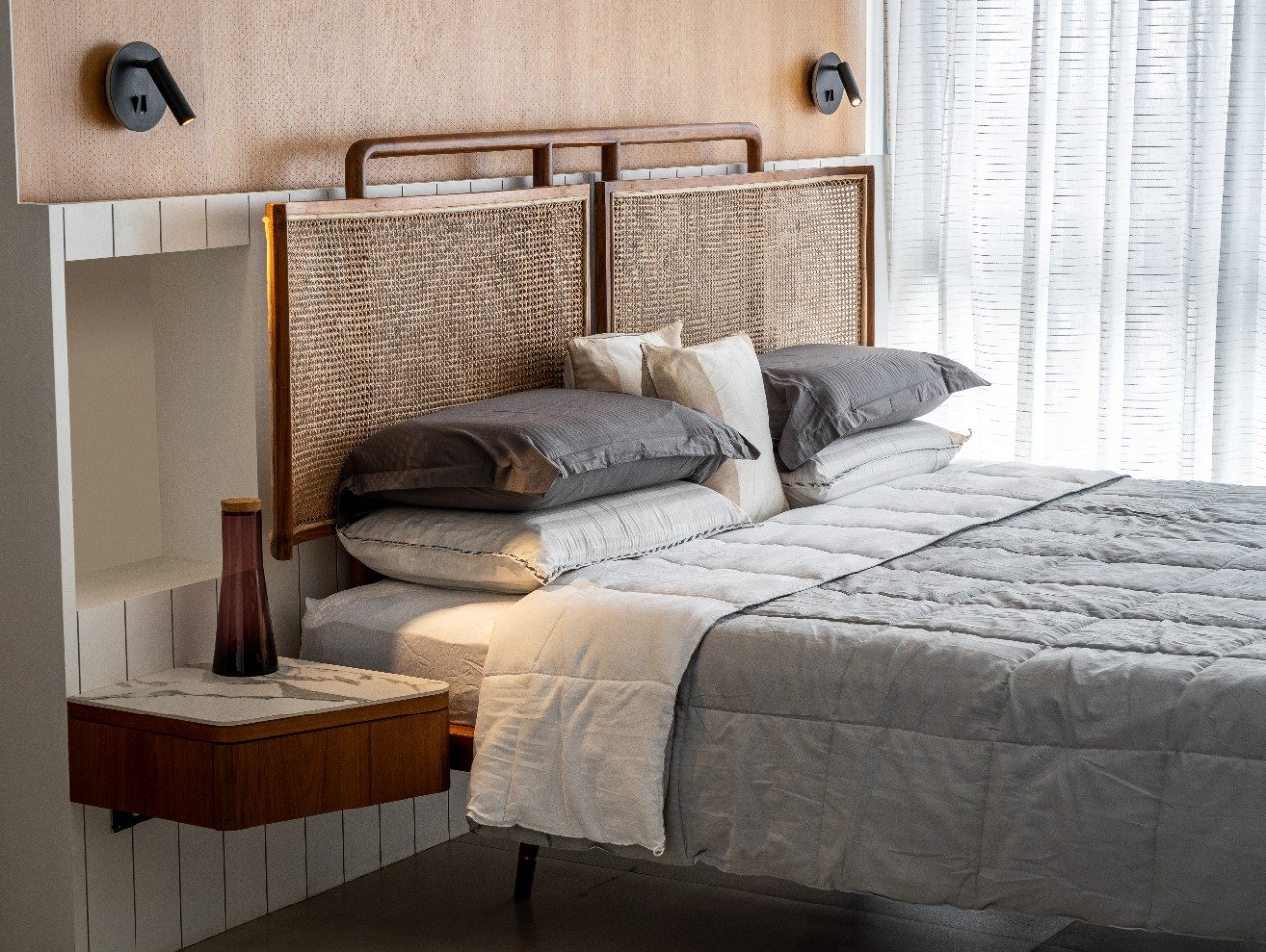
The second master bedroom is doused in an umber warmth, with subtly patterned veneer becoming the frontrunner. The two-panelled headboard is composed of woven cane and teakwood, placed against the bipartite feature wall. The top half of the wall has been finished in grained veneer, whereas the base sports a white vertical shiplap pattern.
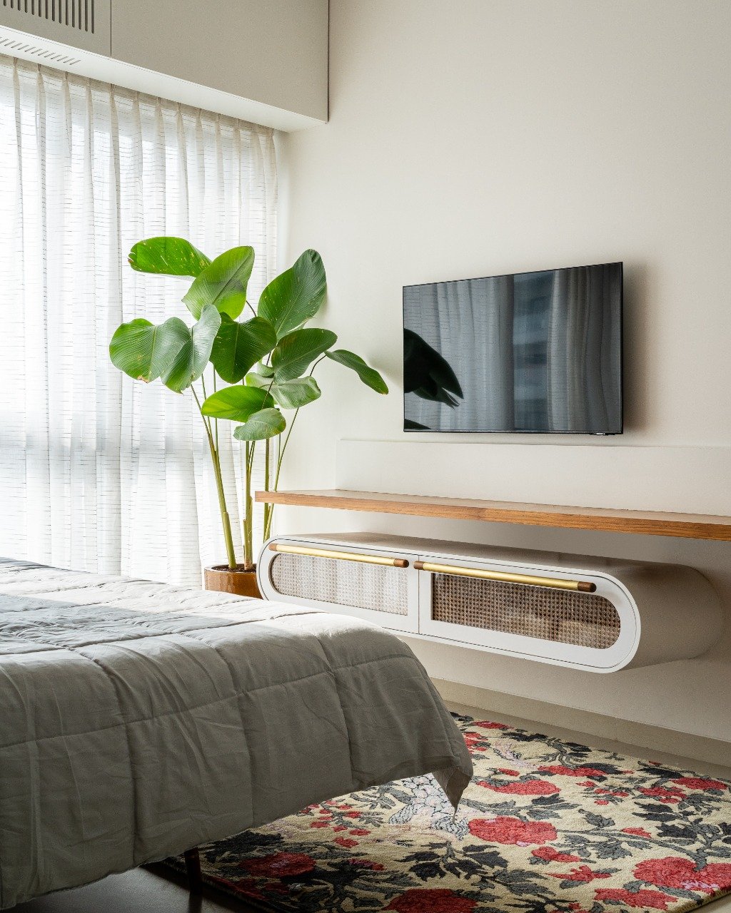
The protruding nightstands extend from the walls, covered with a marble top and veneered body. On the opposite end, a running wood ledge hugs the wall’s length only to be interjected by an oblong cane-faced cabinet that leads further towards the television console. Colour makes a welcome cameo in the bedroom, coming forth through the robust floral rug by HummingHaus within the monotone space.
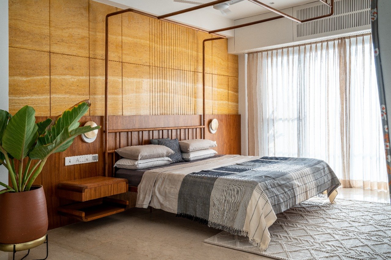
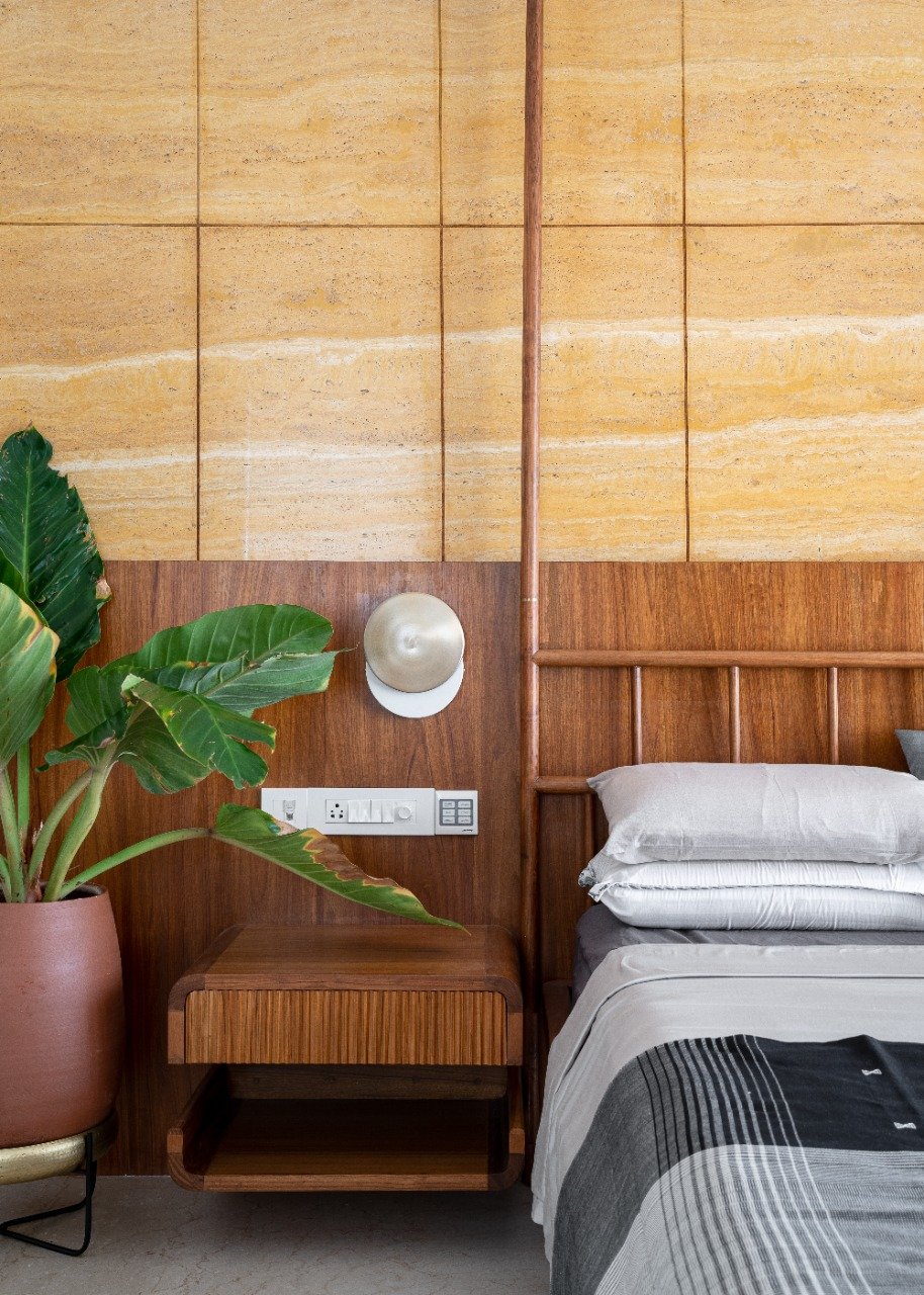
Conversing with balmy yellows, the ensuite master borrows its definitive trait from the saturated hue of the travertine stone. The wall anchoring the bed doubles up as a vivid backdrop against which the tapestry of the space comes undone. Grooved travertine stone lines the top half of the wall, creating a geometric progression of sorts, while the bottom is covered in a wood veneer. The bed herein is an unconventionally playful take on a classic four-poster bed. The supporting framework has been conceived as an inverse of the traditional design, contorting its form upwards to tether itself to the ceiling. The nightstands seem like organic extensions of the headboard wall, emerging monolithically from the veneered surface.
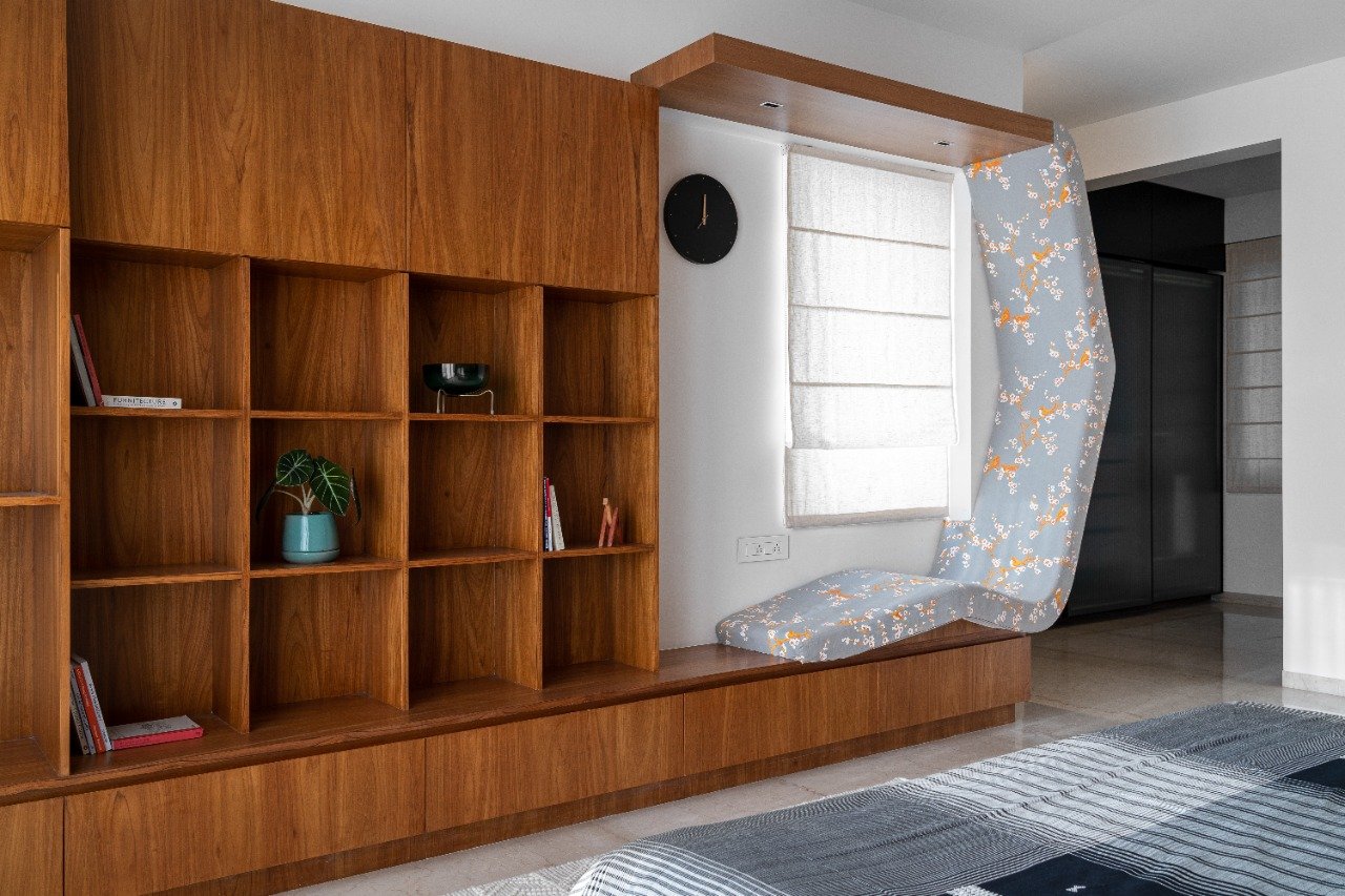
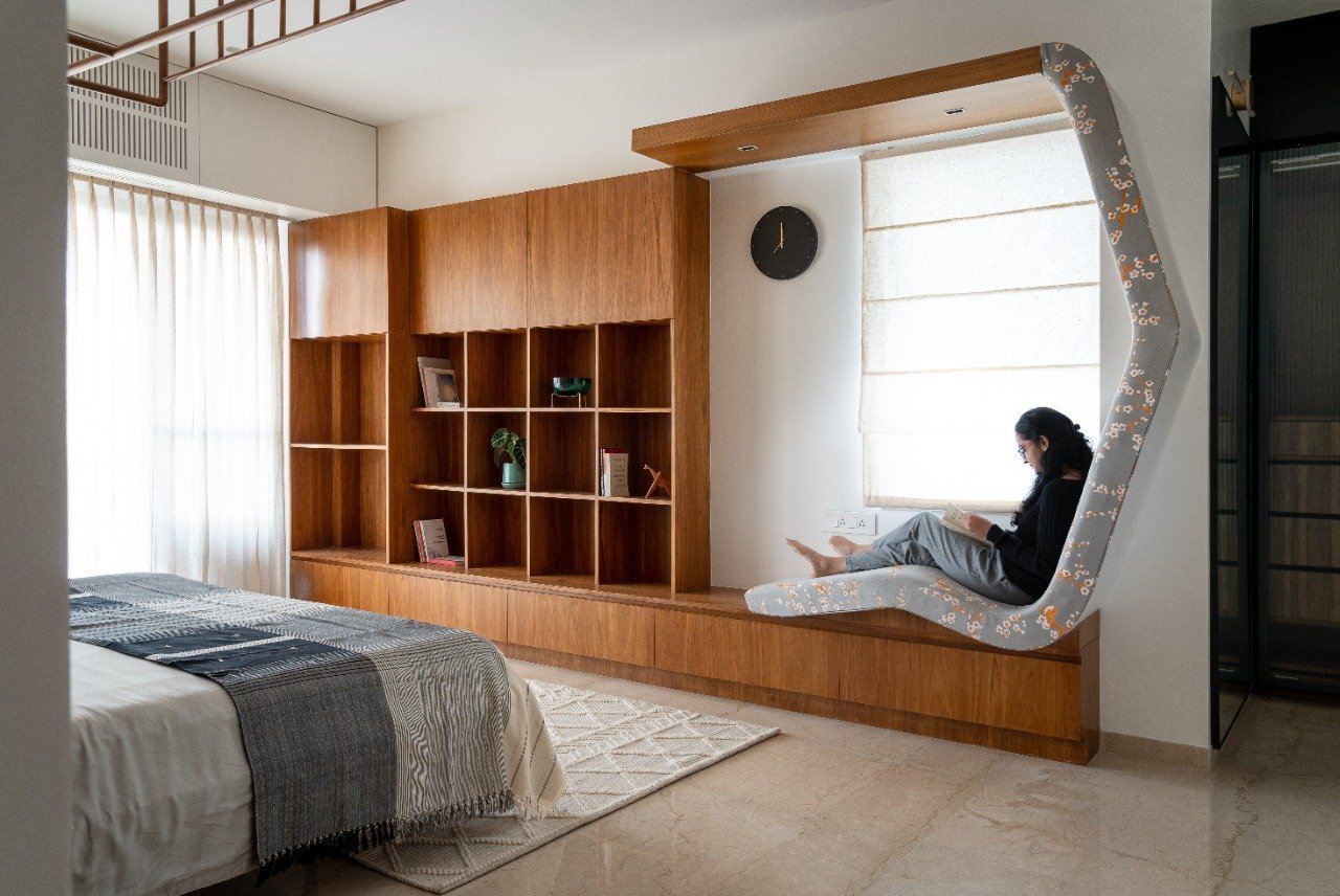
A bibliophile’s haven, the entirety of the other wall’s length has been treated as a composition of open storage and a novel reading nook. “A grid of square shelves layers the wall, creating numerous niches to store and display reads and bric-a-brac. The custom reading seat takes on an angular profile, creating an almost cradling silhouette that allows one to read for hours on end while seated in an ergonomically viable position,” states Shravan. A pale grey chinoiserie floral pattern stipples the seat, contrasting against the continuity of the wood tones. A textured geometric rug in ivory by HummingHaus inhabits the space, uniting the presiding colour palette of the room.
The master bath was redone entirely, rendering the mundane builder-grade bathroom with a new lease of life! Flecked beige terrazzo tiles have been used as wall dadoing and over the vanity countertop with a rust-hued earthen tile, both acquired from Bharat Floorings. In addition, sinuous-patterned wood panels create a visual semblance of movement as they travel across the ceiling and into the bathroom chambers.
“Neutrality and a pertinent sense of calm within this home in no manner give way to a lack of character. Instead, the dwelling finds its bearings in the maxim of less being more, shining a light upon the modest yet impactful role materials play in the design process,” conclude the Principal Architects. At Peninsula 10, humble materials have been explored with abounding clarity, nuanced with keen attention to detail. As a secondary residence, the spaces silently applaud the unpretentious identity of the home while ensuring that familial warmth remains sacrosanct.
This piece was published on The Architect’s Diary (June 2022).
